Reducing drop-off by 12% through progressive onboarding in a B2B aggregator.
I joined AuctionAutoPlace when development was already underway, with no design, no requirements, and no clear product vision. I ran the research from scratch, defined the feature roadmap with stakeholders, and shipped a complete mobile app that outperformed the existing website's onboarding by 12% on day one.
- Company
AuctionAutoPlace
- Platform
B2B, Native Mobile App (iOS & Android)
- my role
Solo Product Designer (End-to-End, UX Research to UI)
- Team
- Key Stakeholder
- Three Developers
- Myself
- Timeline
16 weeks - 2025
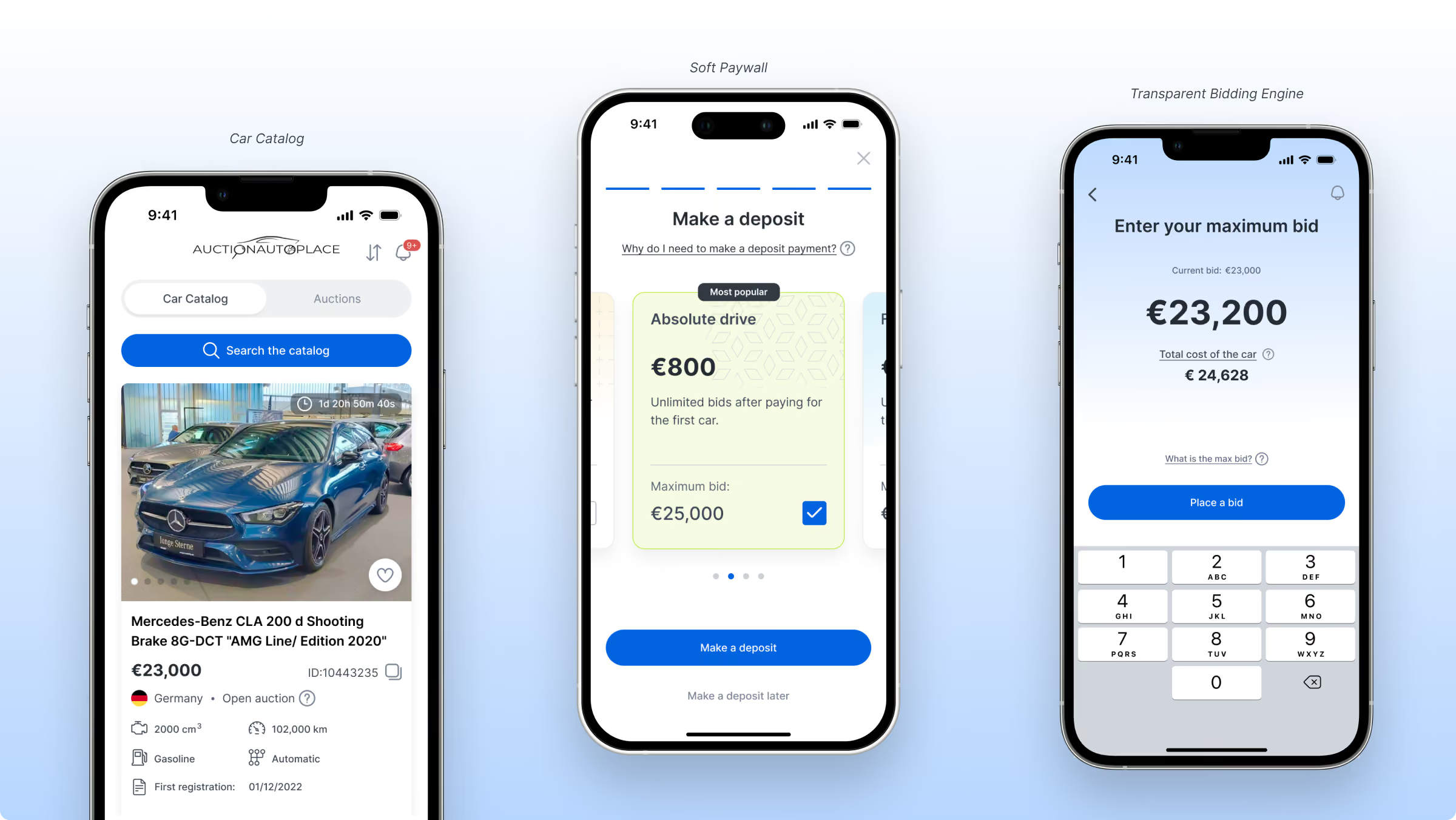
About AuctionAutoPlace:
AuctionAutoPlace is a comprehensive B2B platform that aggregates hundreds of European car auctions into a single, unified marketplace. The platform handles bidding, delivery, and customs clearance. With 86% of web traffic coming from mobile, I was tasked with designing a native app from scratch in just 16 weeks.
The Challenge
I joined the project after development had already started, facing several critical roadblocks:
- Missing requirements: the team was building without a clear timeline and the project requirements, trying to force clunky desktop patterns onto a mobile experience.
- The 80% drop-off: the legacy website operated as a "closed club." Users were forced to register and pay a monetary deposit before testing the platform. This hard paywall caused a staggering 80% drop-off.
- Stakeholder resistance: stakeholders initially demanded we copy this exact closed model into the new mobile app.
This strict paywall and lack of clear direction were driving away potential buyers before they even saw a single car. My task was to step into this chaotic environment, convince stakeholders to open up the app, and design a smooth, user friendly mobile experience from scratch in just 4 months to boost user retention.
The Hypothesis
If we replace the hard paywall with a soft paywall, then the drop off rate will decrease from 80% to 70% and the activation rate will increase. This happens because users can explore the app, understand its value, and reach their "aha" moment before committing financially.
THE METRICS
We tracked the Onboarding Completion Rate as our primary metric and the Activation Rate as our secondary metric.
The Result
The soft paywall flow actually decreased the drop off rate from 80% to 68% at launch. We beat our 70% goal and retained 12% more buyers right at the top of the funnel.
Product discovery
1. The Business Problem
When I joined this project, I knew absolutely nothing about the scope of work. My only clear directive was simple: design a mobile app based on web platform functionality.
Before sketching a single screen, I refused to guess the solution. I needed to understand the core business logic first. How does this company make money? Where is the current funnel leaking? Why do they actually need a mobile app right now?
To dig up these answers, I started by conducting deep stakeholder interviews to audit their business strategy, operational bottlenecks, and existing sales flow.
2. The UX Hypothesis: Fixing the Gate
During these business alignment sessions, I uncovered a critical insight about their legacy web funnel. The platform required a mandatory upfront financial deposit just to access the service.
That is when the real product problem clicked.
It didn’t matter how beautiful, fast, or polished the final mobile application would be if users were blocked from ever seeing it. If our onboarding flow forced a high financial commitment before letting buyers touch the product, they would never reach their "aha" moment. I realized we had to completely re-engineer the onboarding experience, or the app would fail before launch.
3. The Soft Paywall: Product-Led Growth
The stakeholder's original logic for the hard paywall was based on their legacy web funnel. Users faced a massive wall of text and were forced to pay a €500 or €800 deposit immediately to see cars. This caused an 80 to 90% drop off rate. To save these lost leads, the company was paying sales managers to manually call dropped users to explain the platform's value.
I realized we could solve this through UX. By introducing a Soft Paywall, we shifted the burden of "explaining value" from the sales team to the product itself..
The Old Way (Web): overwhelming forms forced an immediate €800 commitment before the user saw any value.
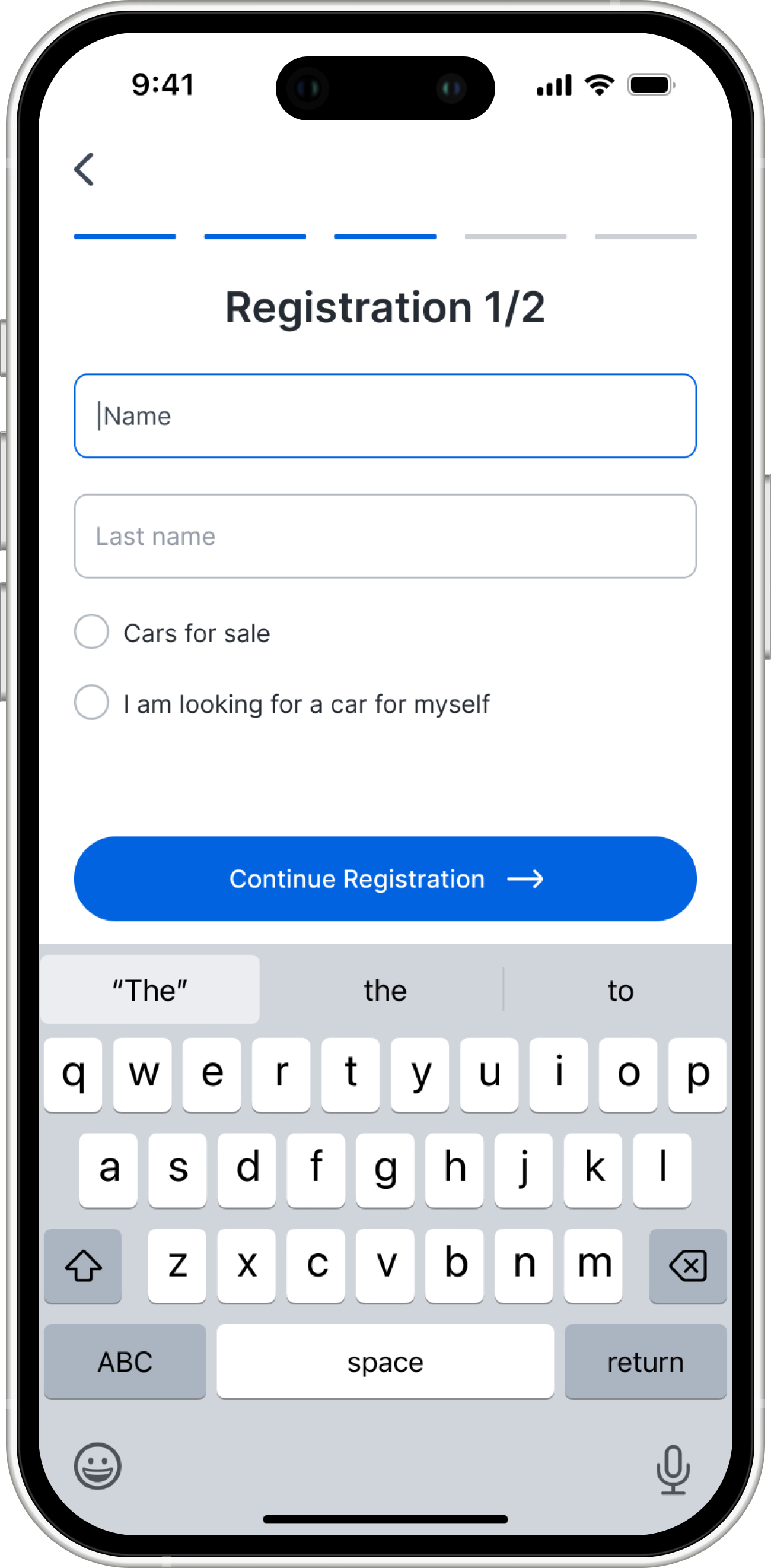
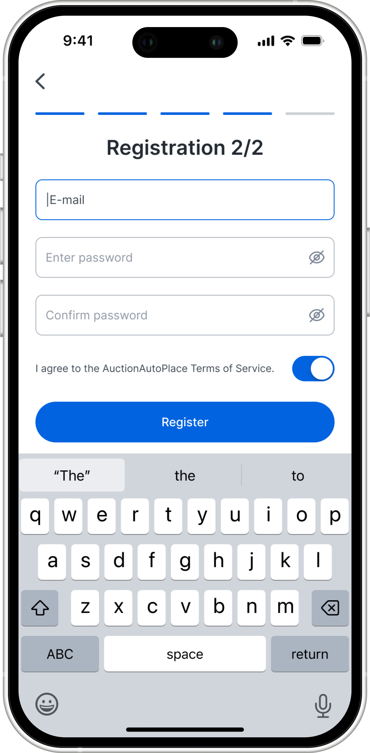
The New Way (App): I broke registration into digestible steps and added a "Make deposit later" skip option.
The Flow
Users could explore the catalog and find a car first, triggering the deposit screen only when ready to bid. This built instant trust and drastically reduced manual sales overhead.
Before (web)
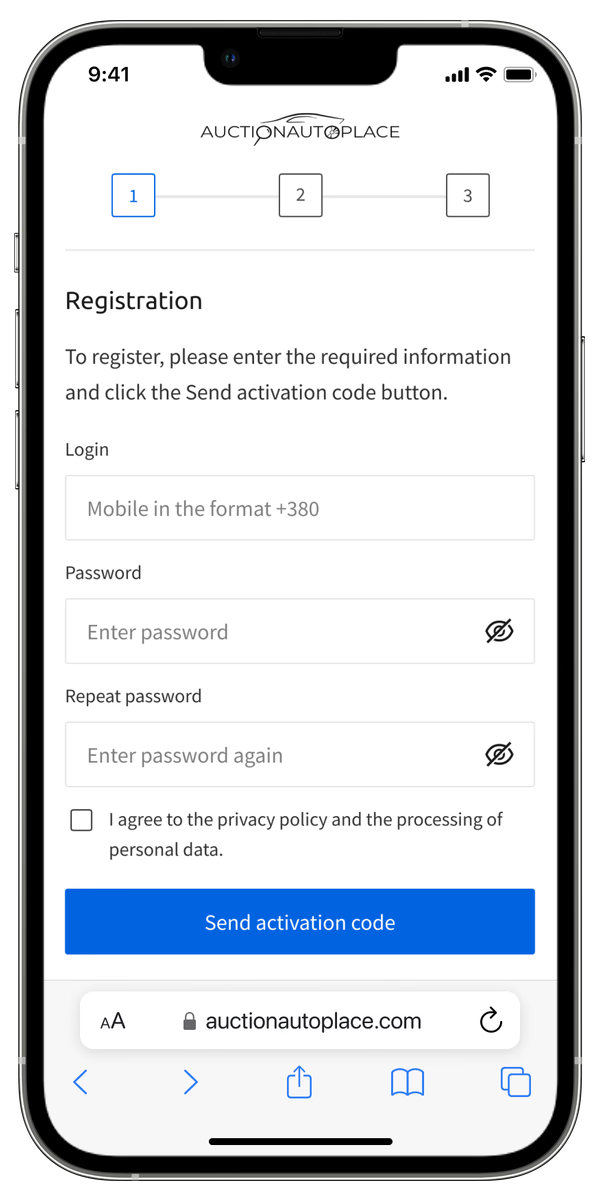
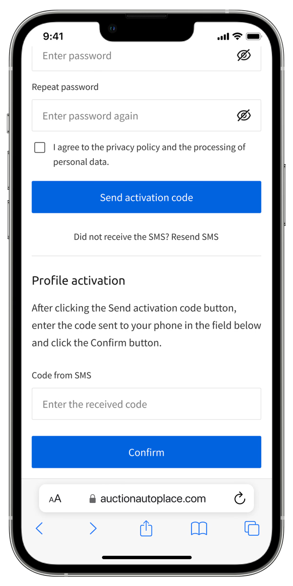
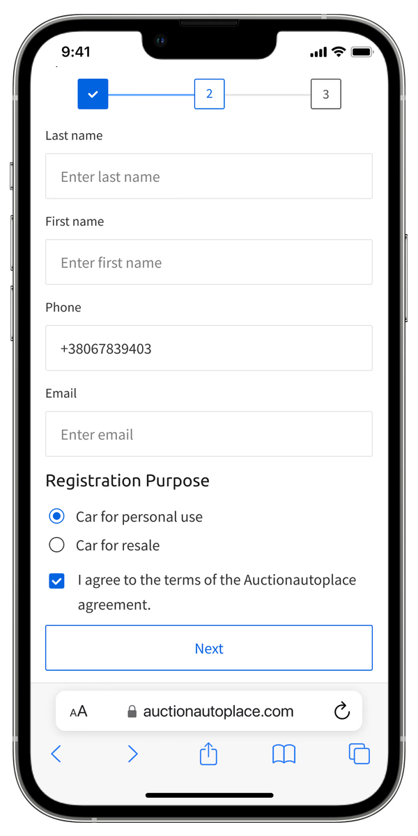
Cognitive overload: long, intimidating forms and tiny touch targets caused high top-of-funnel drop-off.

After (app)
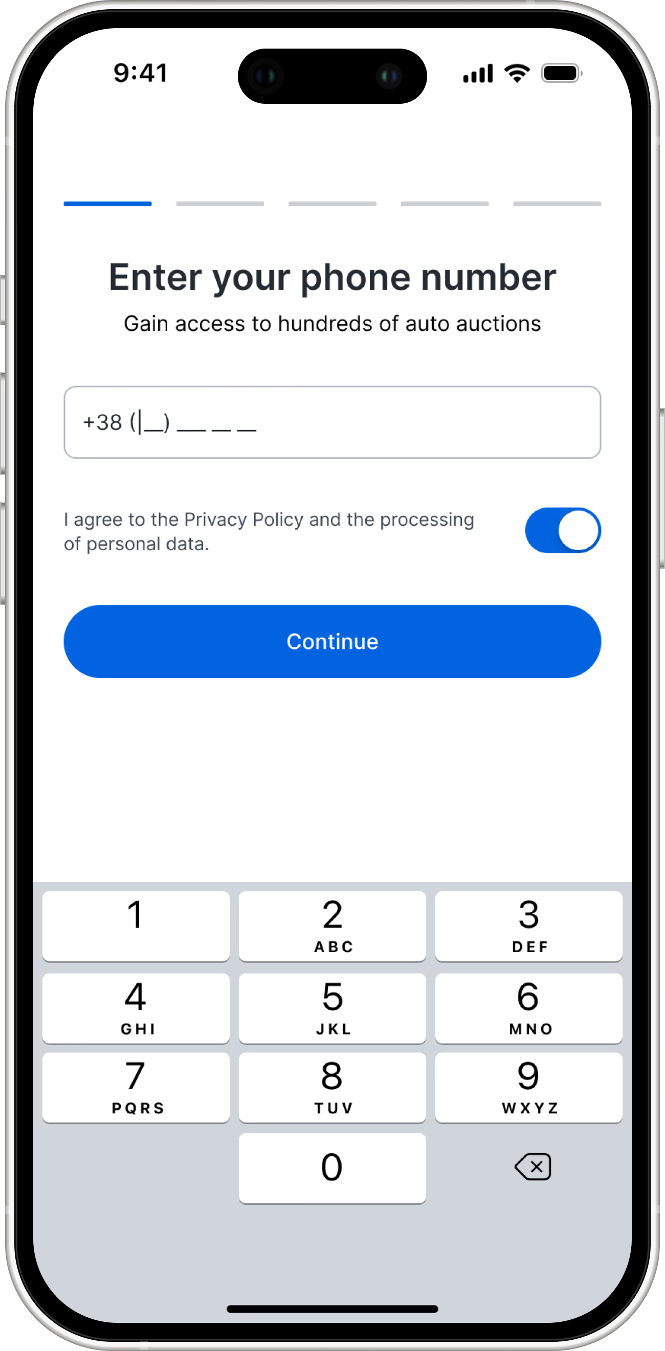
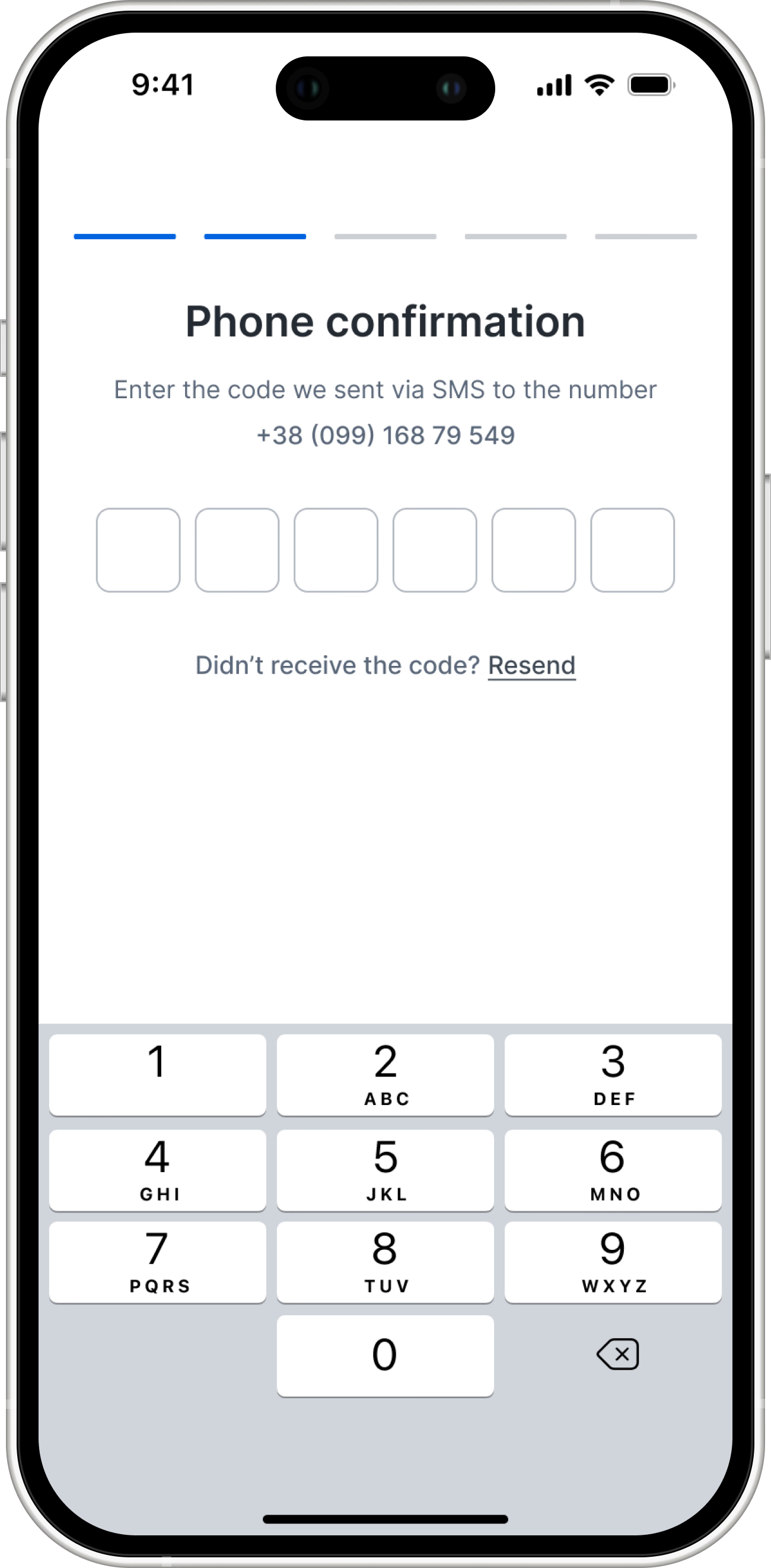
Low-friction entry: swapped registration for a fast OTP phone login to capture user intent immediately.

Progressive disclosure: broke complex data requirements into bite-sized, sequential steps to keep momentum high.

- Cognitive overload: long, intimidating forms and tiny touch targets caused high top-of-funnel drop-off.
- Low-friction entry: swapped registration for a fast OTP phone login to capture user intent immediately.
- Progressive disclosure: broke complex data requirements into bite-sized, sequential steps to keep momentum high.
Before (web)
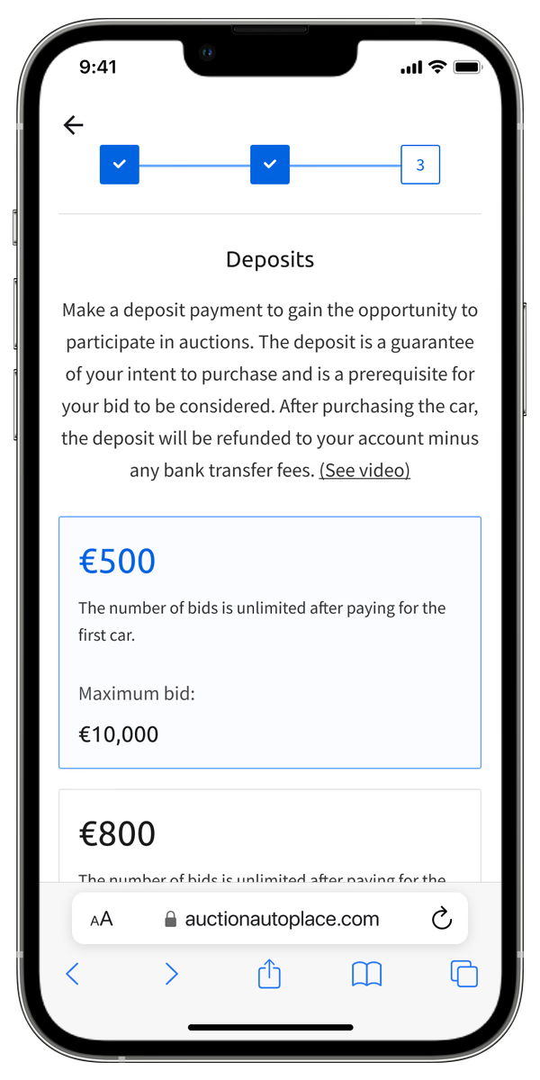
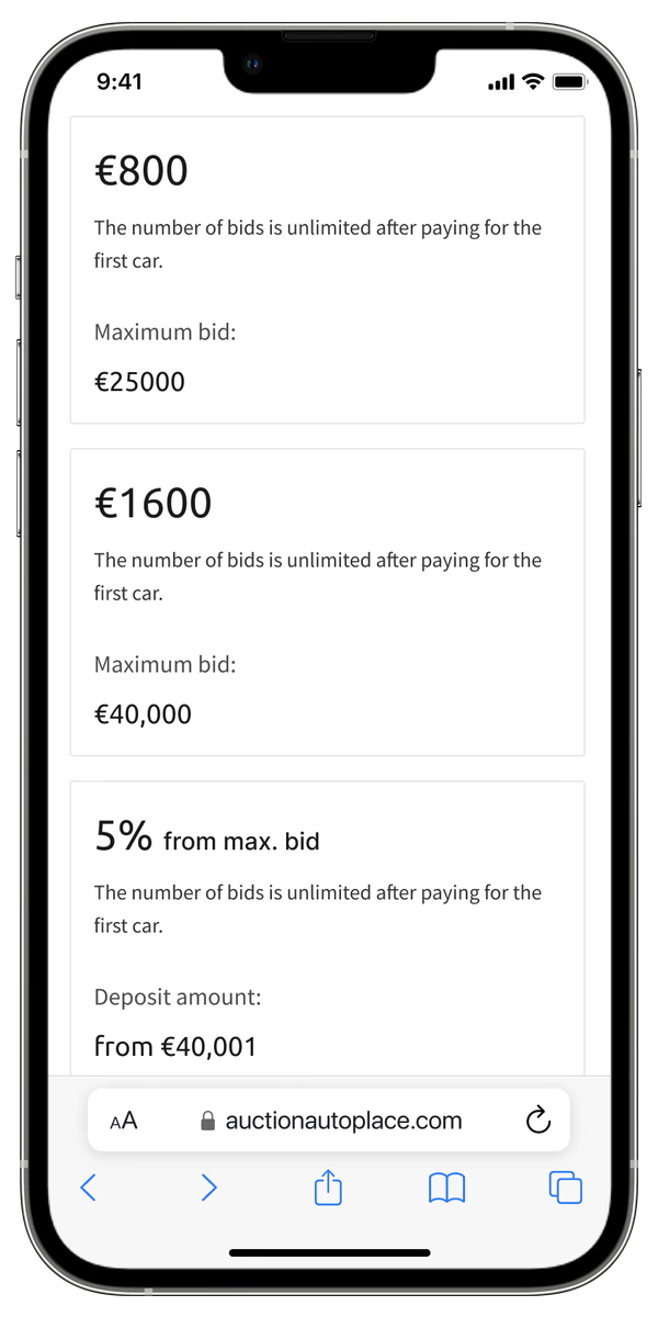
The trust barrier: dense legal text and a forced financial commitment completely blocked product discovery.

After (app)
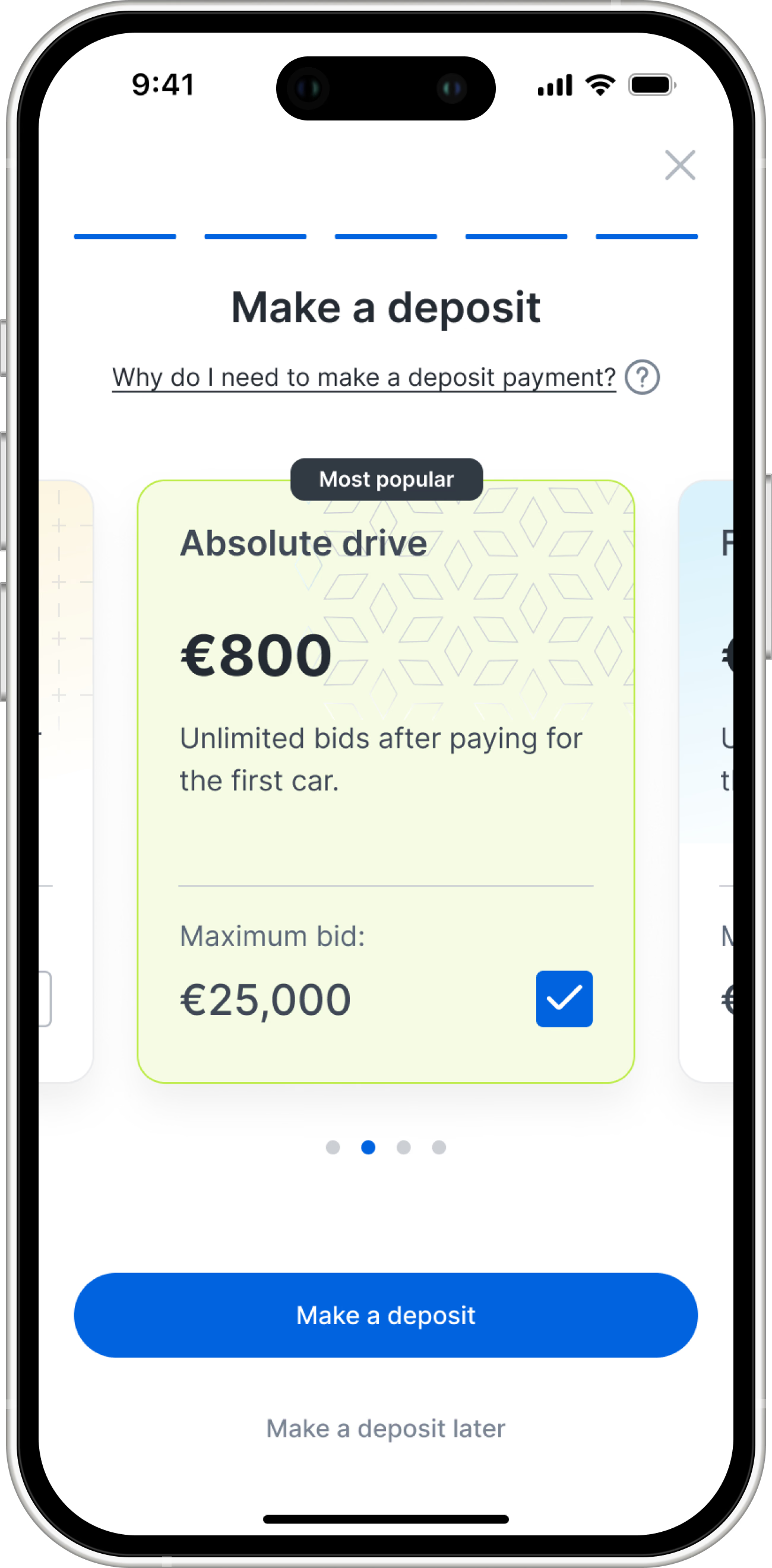
Analytics showed €800 is the most popular tier, so it pre-selected by default. Other options are tucked into a horizontal scroll to keep the screen uncluttered and prevent decision fatigue.

Adding a simple skip option lets users explore the car catalog risk-free before paying, shifting the experience to a product-led approach.

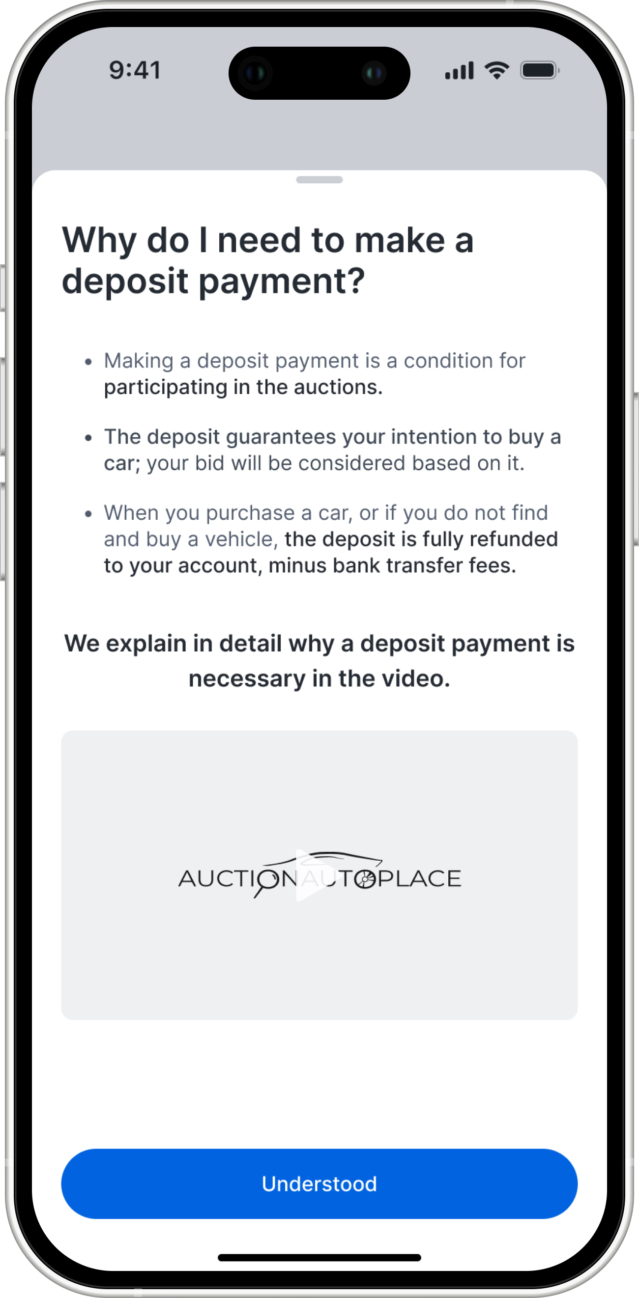
Complex legal details and explanations were moved to an optional bottom sheet so the main screen stays clean and focused on the primary action.

- The trust barrier: dense legal text and a forced financial commitment completely blocked product discovery.
- Analytics showed €800 is the most popular tier, so it pre-selected by default. Other options are tucked into a horizontal scroll to keep the screen uncluttered and prevent decision fatigue.
- Adding a simple skip option lets users explore the car catalog risk-free before paying, shifting the experience to a product-led approach.
- Complex legal details and explanations were moved to an optional bottom sheet so the main screen stays clean and focused on the primary action.
understanding user needs
Finding the Root Cause
To figure out exactly what these buyers needed, I conducted 5 in-depth interviews with active car resellers on the platform. I quickly realized a fundamental truth that shifted my entire design strategy: B2B resellers do not acting like normal consumers.
They are not looking for a specific "dream car." They are shopping strictly for profit margins. Based on this, I defined three core UX pillars for the app:
key insights
The insight: resellers shop for profit margins, not dream cars. The search experience must prioritize strict budget limits and damage types over standard make and model.
“Sorts cars by price, from cheapest to most expensive, to find bargains”
“Checks competitor websites like AutoScout24, mobile.de, or Exleasingcar to find better deals or more options.”
“I wish there was a statistics on prices... for which the sellers gave the car away, a sold car for such and such a sum"
The insight: hidden fees destroy trust. The platform must calculate and display the exact final cost, including delivery and customs, before a user places a bid.
"This deal looks good, but what will the final cost actually be? I bet there are hidden fees that will wipe out my profit."
"Manually tries to calculate the final costs of customs duties and delivery."
"The seller fees are very large, there are fees that make it unrealistic to place a bid"
The insight: buying damaged cars without seeing them is a massive risk. We need to provide standardized, instantly readable damage reports to build bidding confidence.
"I can't trust this listing. What are they hiding? If the description is vague, I'm not risking my money."
“The handwritten text in reports is impossible... you use 2 devices, on the tablet you read the text, on the phone you use a translator"
"Stressed when trying to decipher confusing reports under the time pressure of an auction."
UX STRATEGY & EXECUTION
Margin-Driven Search
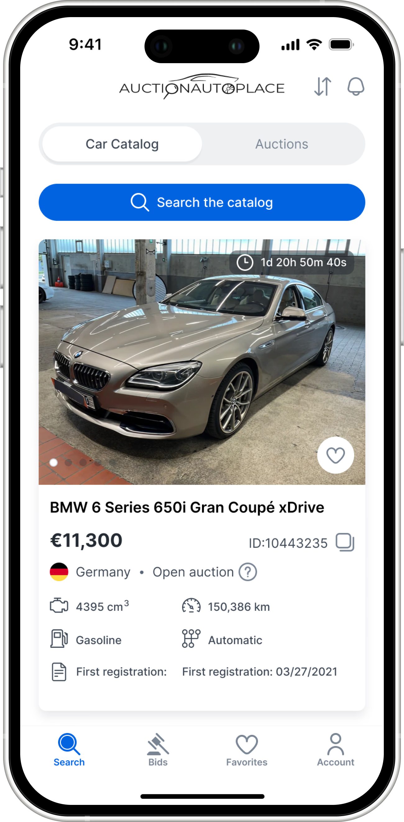
When designing the core search and filtering experience, I knew we didn't need to reinvent the wheel. Our target users are professional car resellers, they already spend a significant amount of their time selling inventory on Auto Ria, the largest automotive marketplace in Ukraine.
Instead of building a custom filter mechanic from scratch and forcing users to learn a new pattern, I conducted a deep competitive analysis of Ayvens Carmarket, BCA Buyer, and Auto Ria. I strategically adapted Auto Ria’s proven filtering framework as our baseline, layering in our unique B2B data points (auction type, country, supplier, in good condition or with technical defects / damaged).
This strategic decision saved weeks of development time for our MVP and ensured users felt instantly familiar with the interface, allowing them to search for profitable margins with zero friction.
The high-level architecture
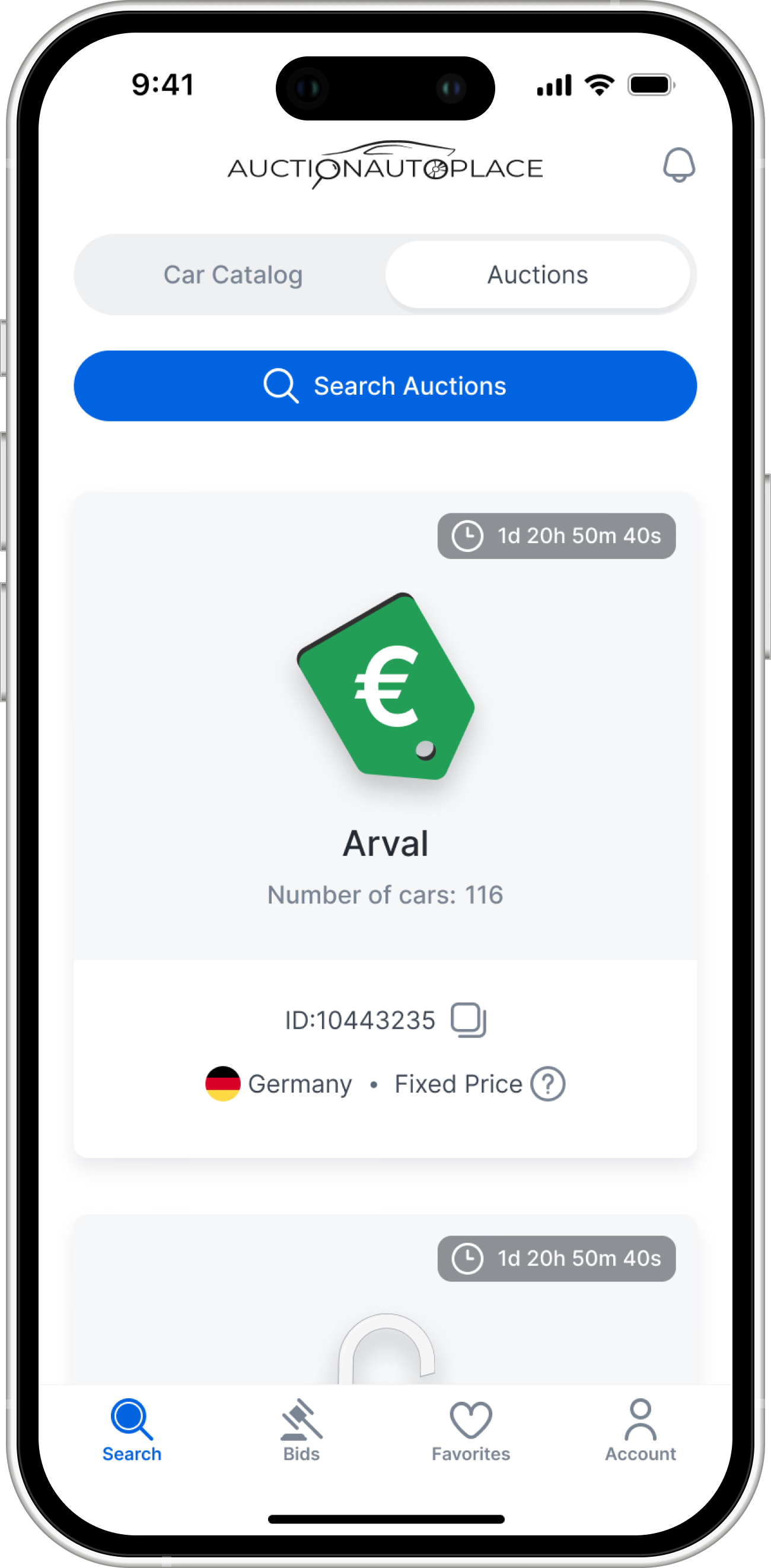
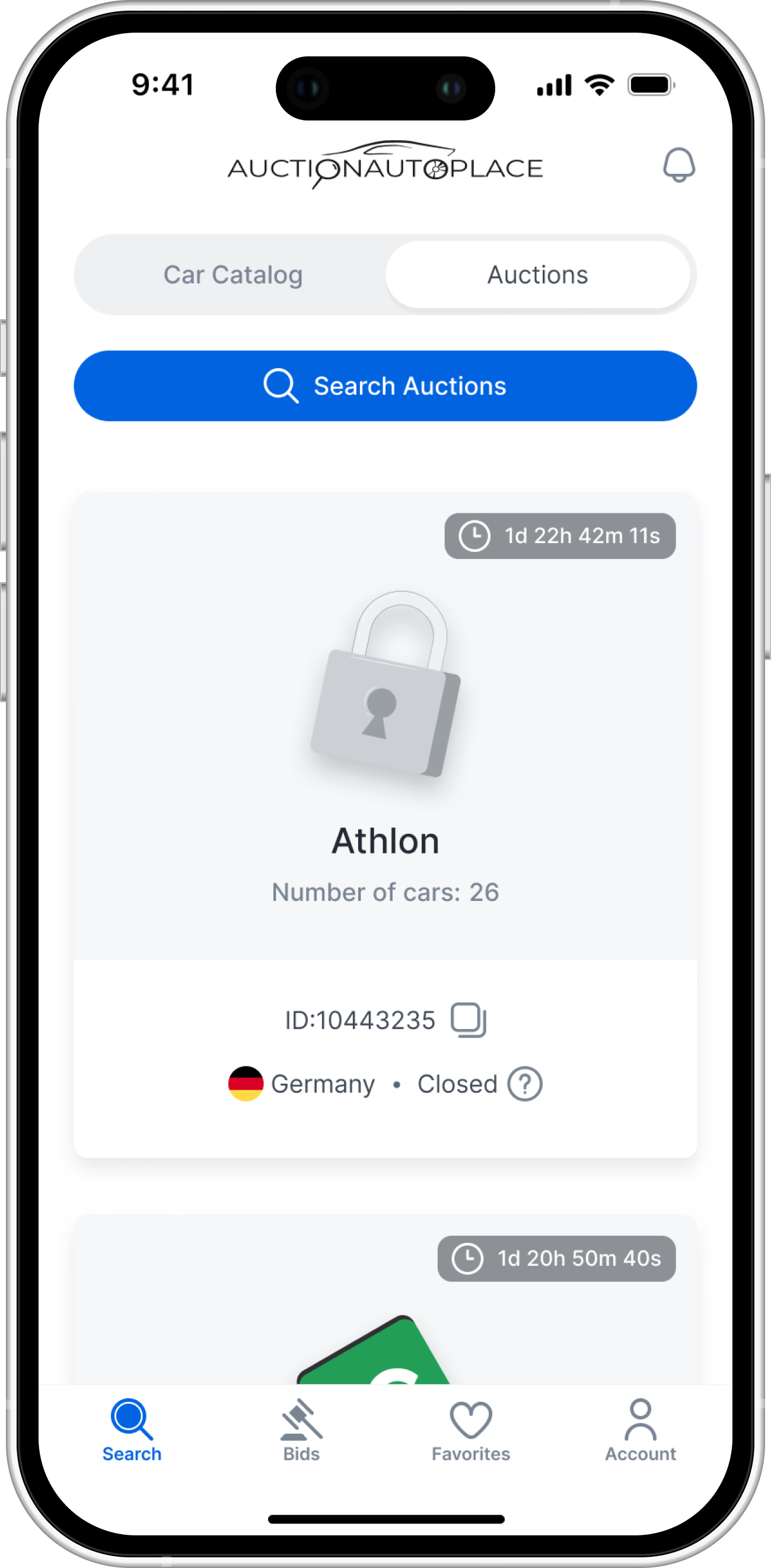
Visualizing business logic: I used distinct colors and icons to instantly communicate the rules of engagement for each auction whether it's an open bidding, a closed blind bid, or a simple fixed-price sale.
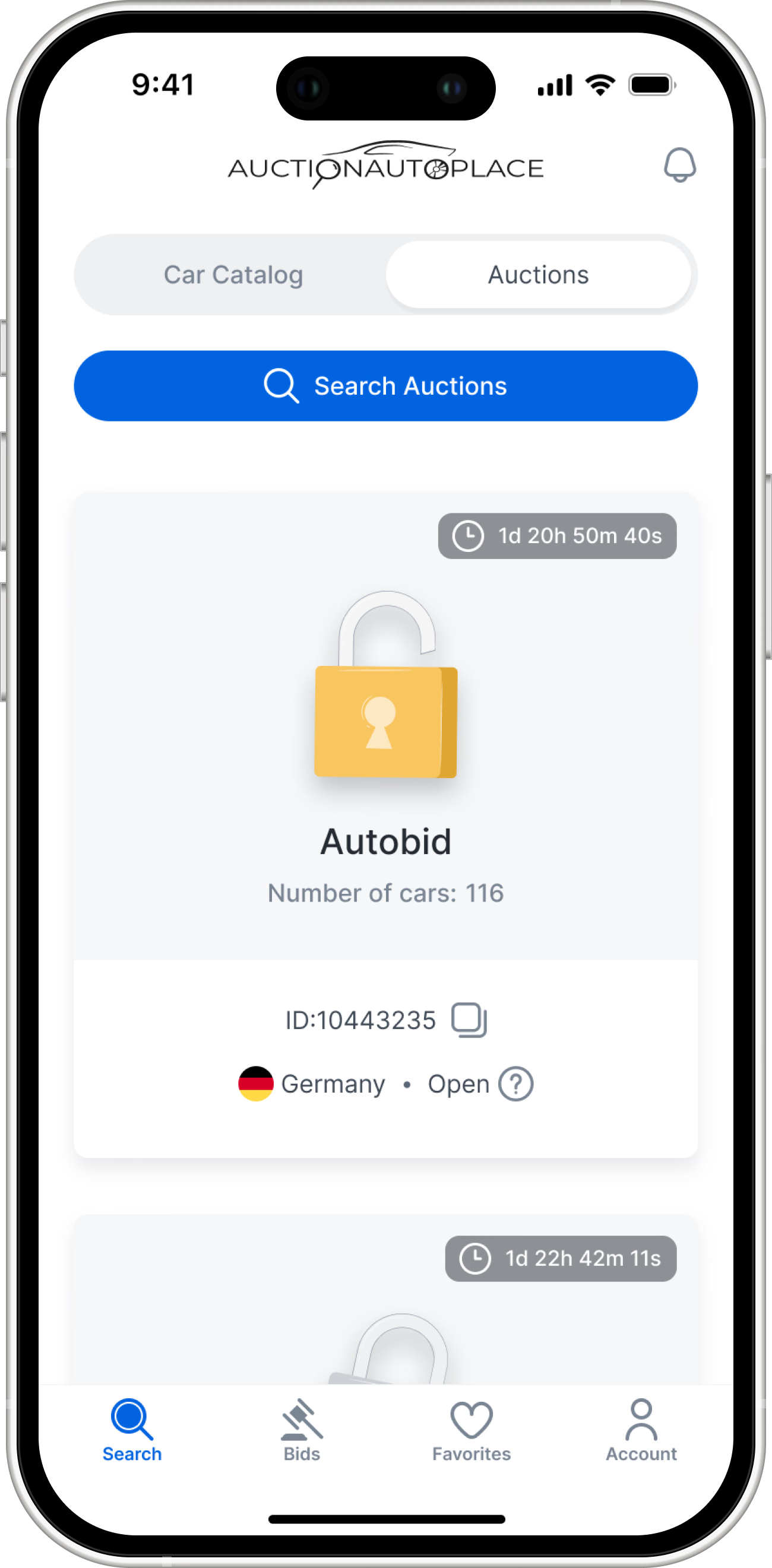
Open: real-time bidding where users can see the current highest offer.
Fixed: a standard "Buy it now" option for instant purchase.
Closed: blind bidding where users submit their maximum offer unseen.
Two distinct workflows. A top-level tab bar let’s resellers search for specific car models across the entire platform, or browse inventory grouped by specific, trusted auction houses..


- Two distinct workflows. A top-level tab bar let’s resellers search for specific car models across the entire platform, or browse inventory grouped by specific, trusted auction houses..
- Open: real-time bidding where users can see the current highest offer.
- Fixed: a standard "Buy it now" option for instant purchase.
- Closed: blind bidding where users submit their maximum offer unseen.
Visualizing business logic: I used distinct colors and icons to instantly communicate the rules of engagement for each auction whether it's an open bidding, a closed blind bid, or a simple fixed-price sale.
Search by car catalog
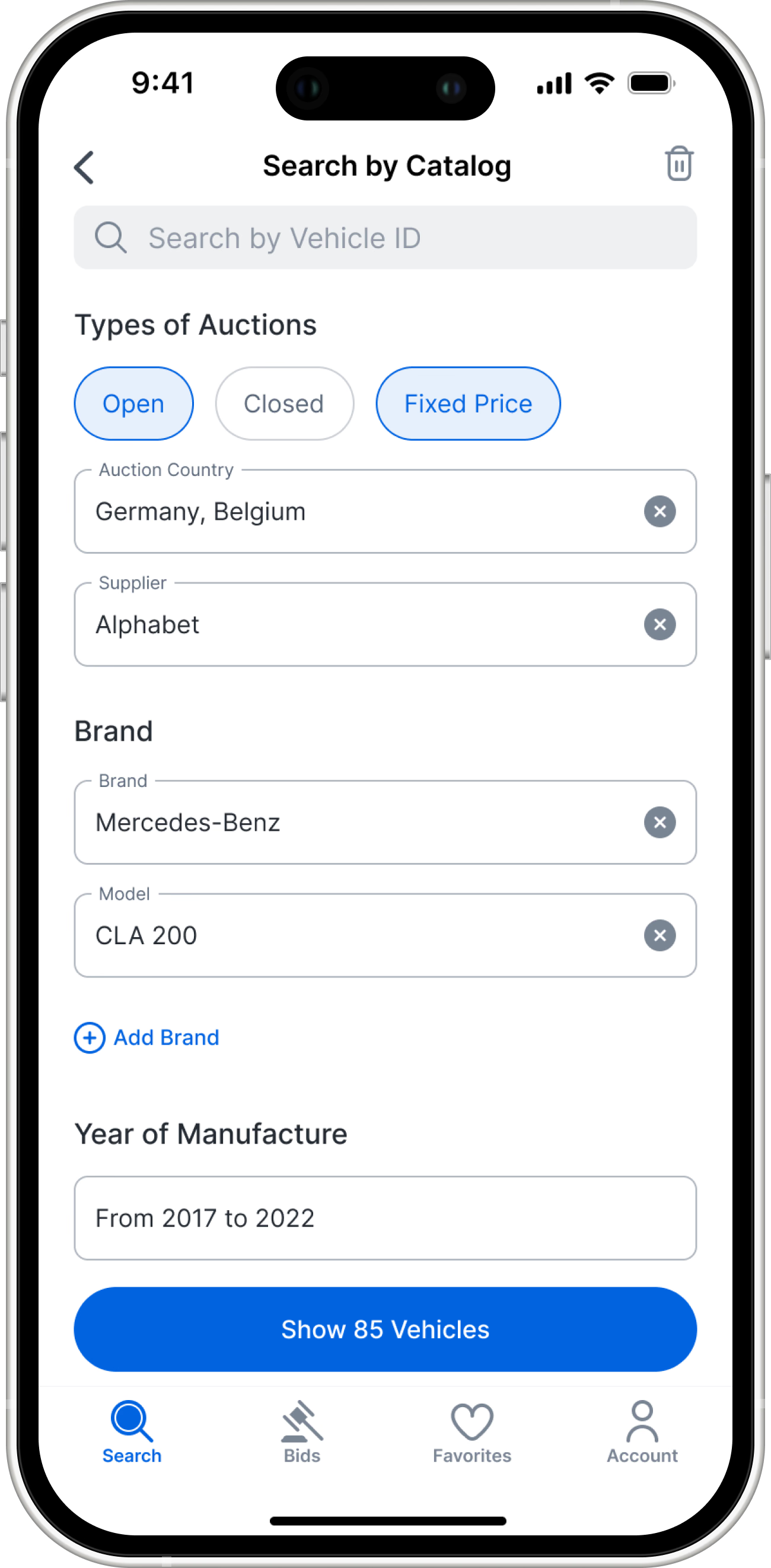
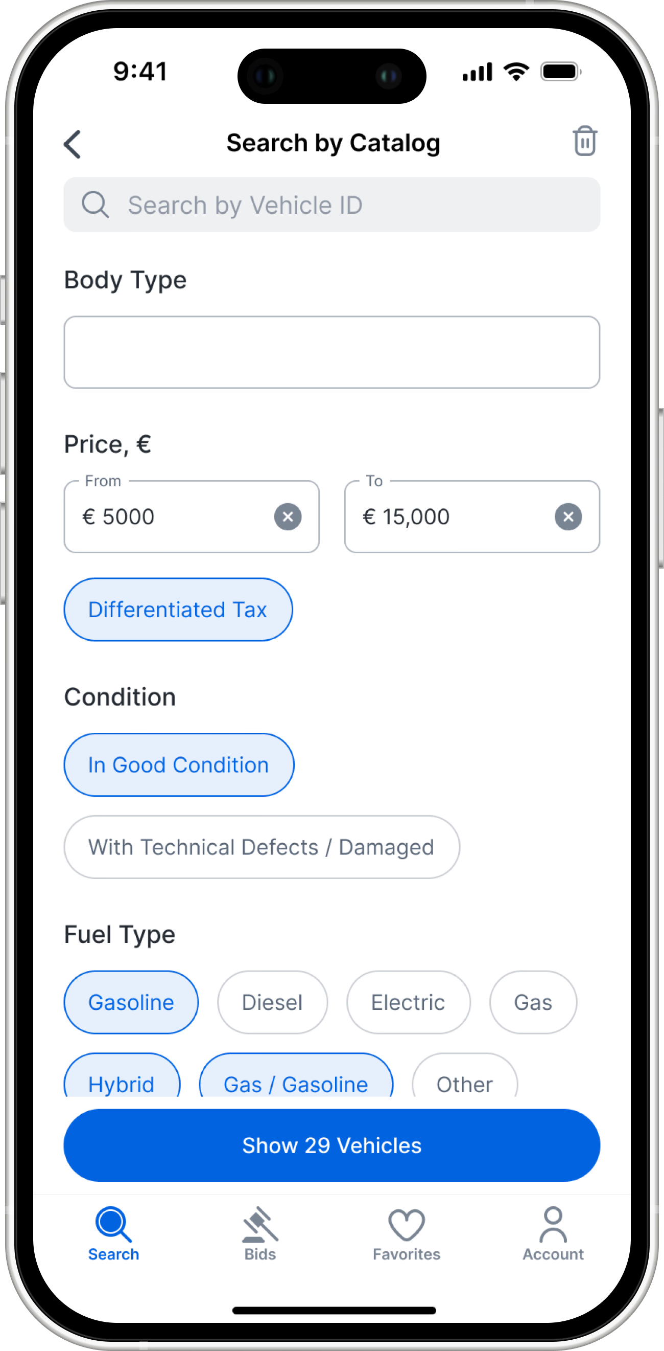
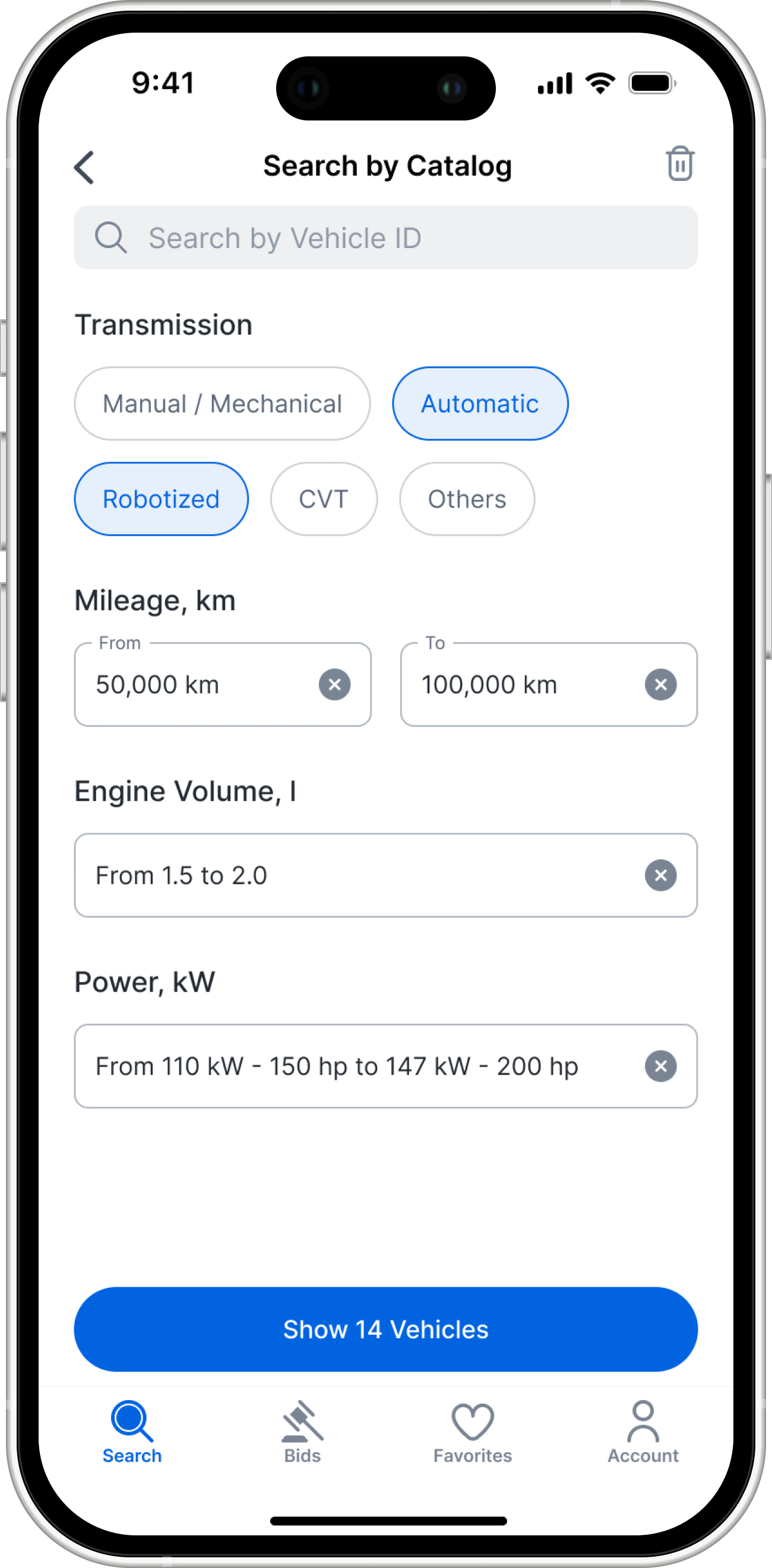
Search by car catalog



- Search by car catalog
Search by Auctions
Professional resellers often buy from specific auctions they trust. This dedicated flow lets them drill down into specific auction houses before even looking at the cars.
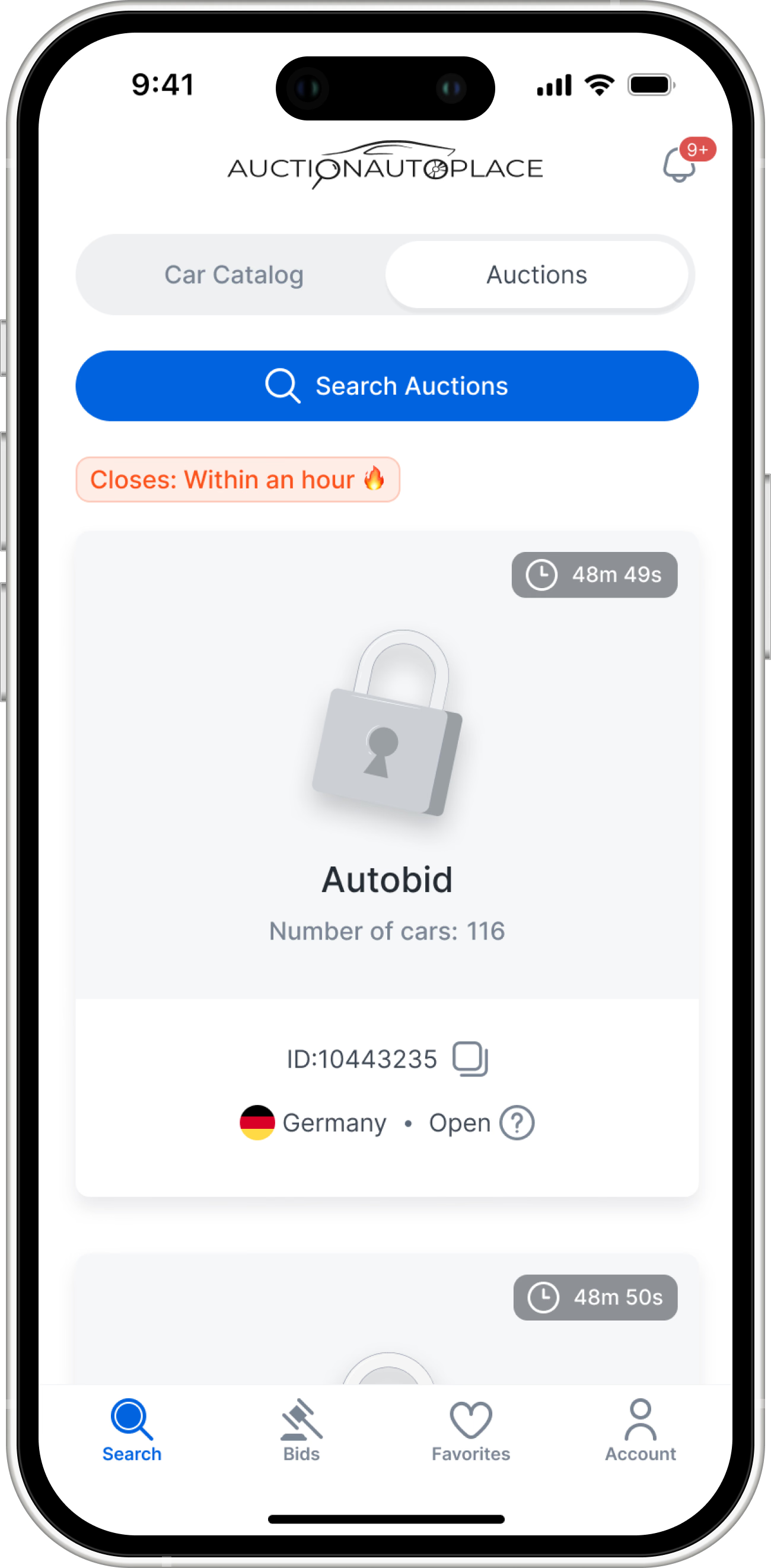
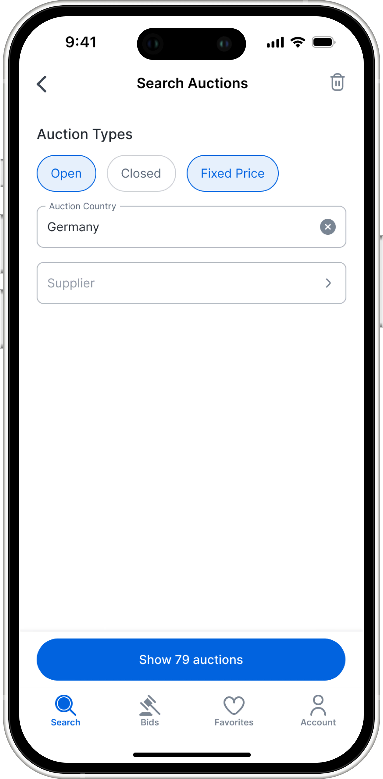
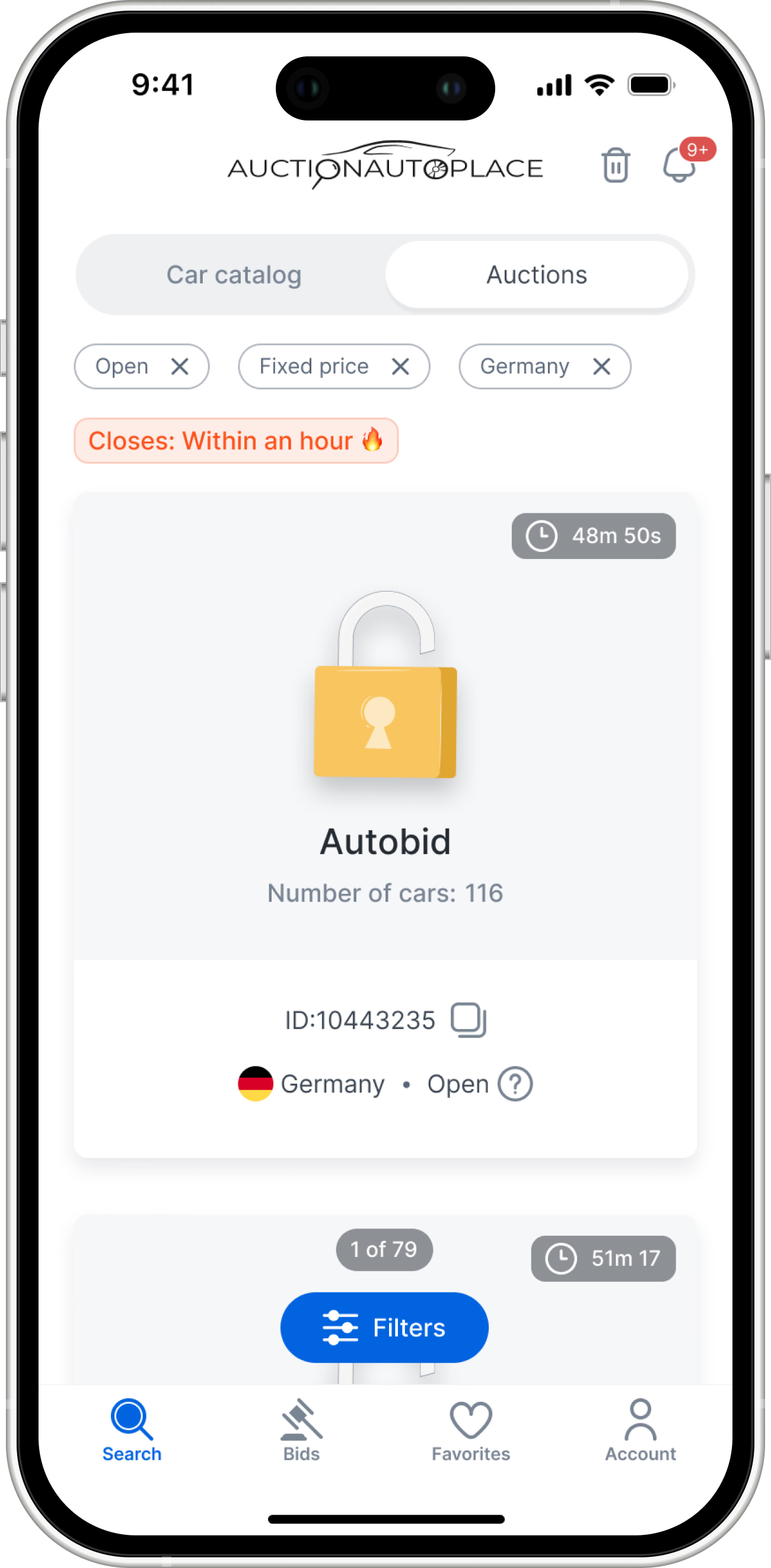
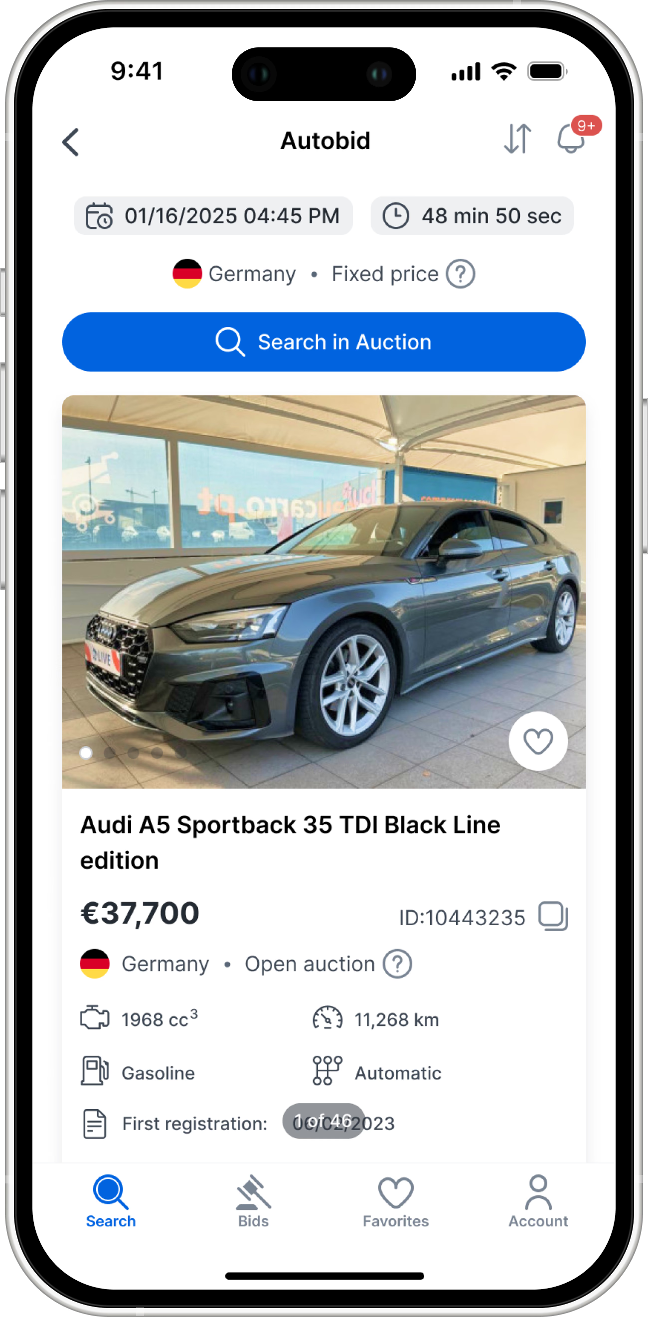
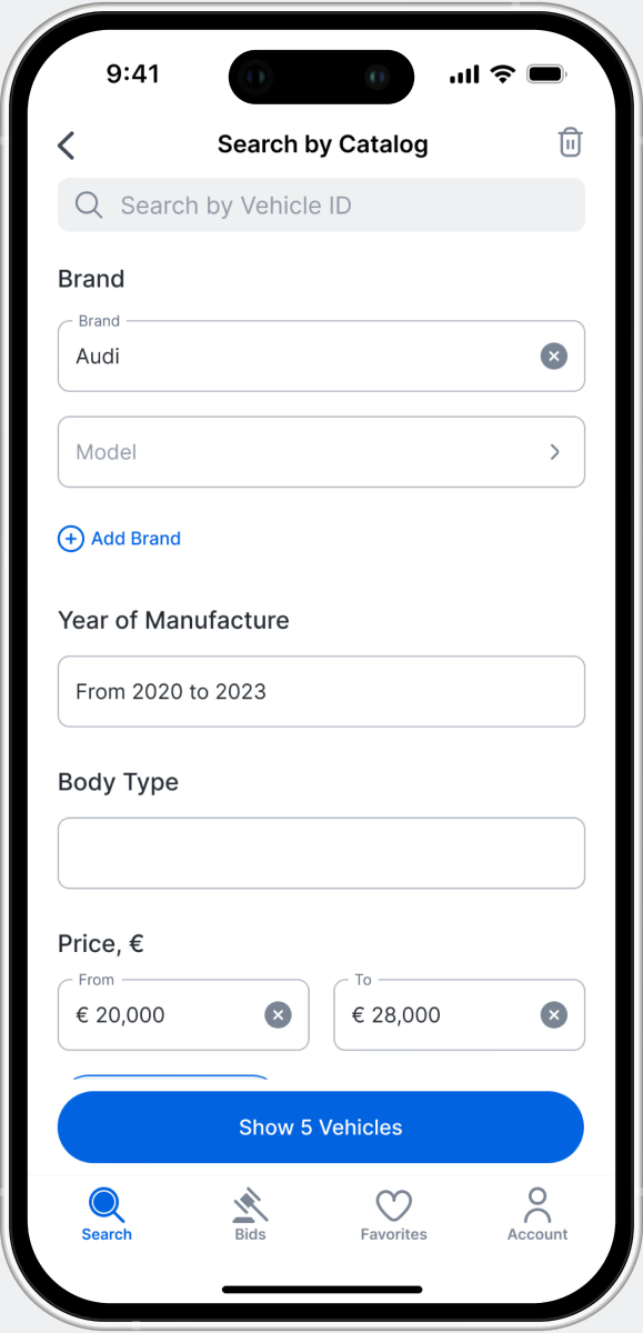
Results matching the buyer's strict criteria.

Vehicles available inside that individual auction
Deep filtering, users can apply standard car filters directly within the auction to find their exact target
Search by Auctions
- Results matching the buyer's strict criteria.
- Vehicles available inside that individual auction
- Deep filtering, users can apply standard car filters directly within the auction to find their exact target
- Search by Auctions
Professional resellers often buy from specific auctions they trust. This dedicated flow lets them drill down into specific auction houses before even looking at the cars.
INFORMATION ARCHITECTURE
Building Trust with Data
Buying a damaged car without seeing it in person requires immense trust. On the backend, we were parsing massive, unstructured arrays of text from various auction houses. If we dumped this raw text onto the screen, users would abandon the platform out of frustration.
I restructured this data dump into distinct, scannable categories (Configuration, Comments, Car Report, and Auction Conditions). To optimize the flow for power users, I introduced lateral navigation at the bottom of the modals. This allows resellers to seamlessly tab through the vehicle's entire technical history without ever losing their context or dealing with click fatigue.
Car Details
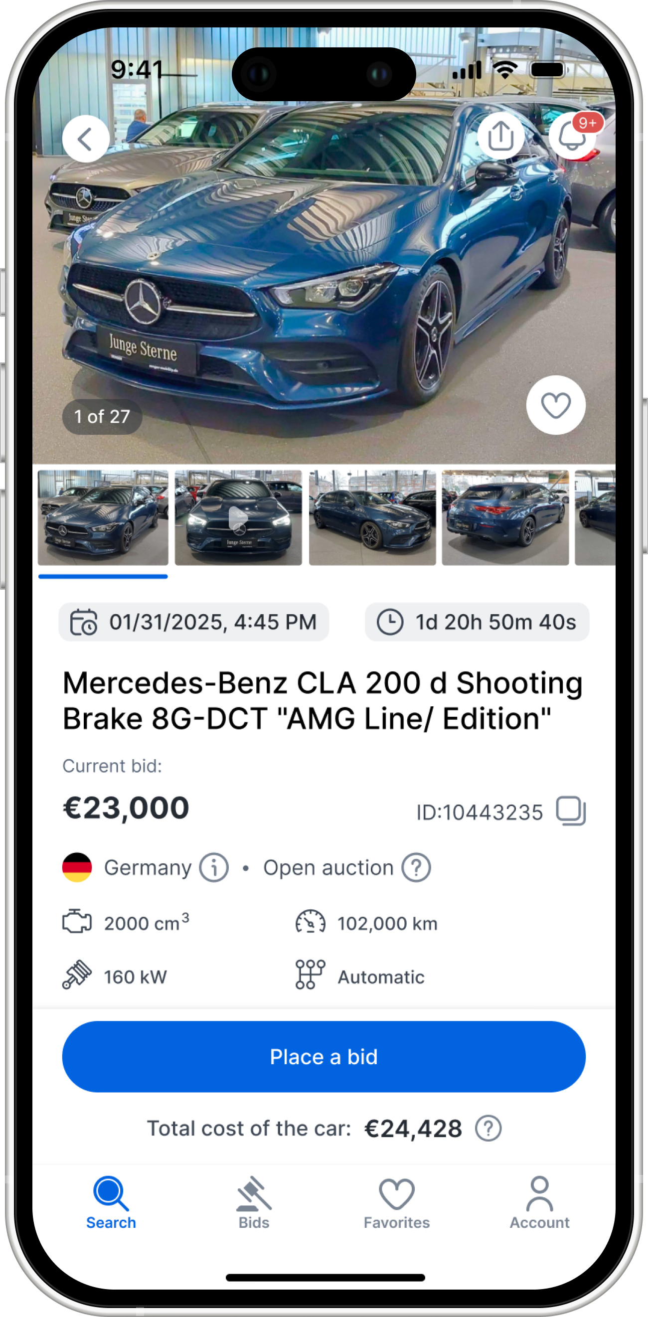
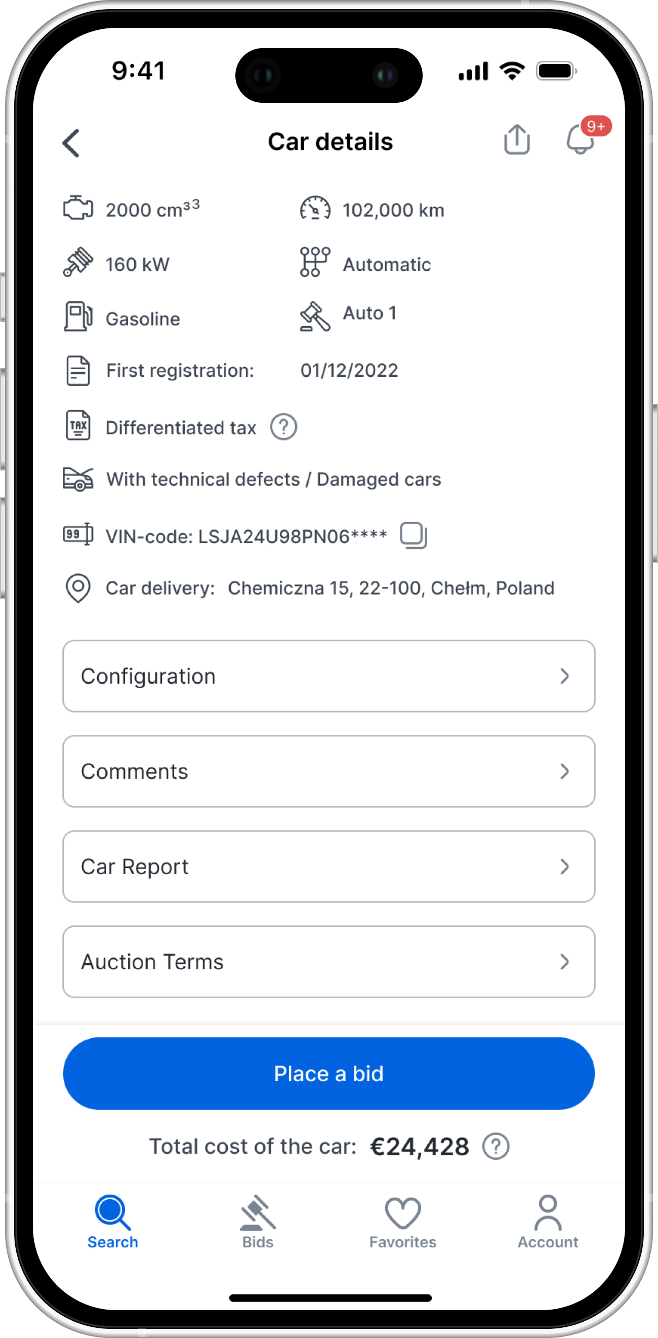
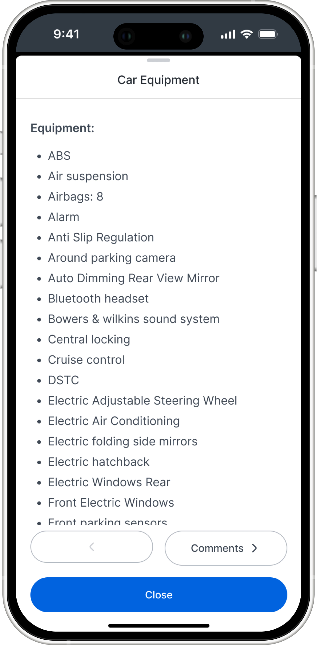
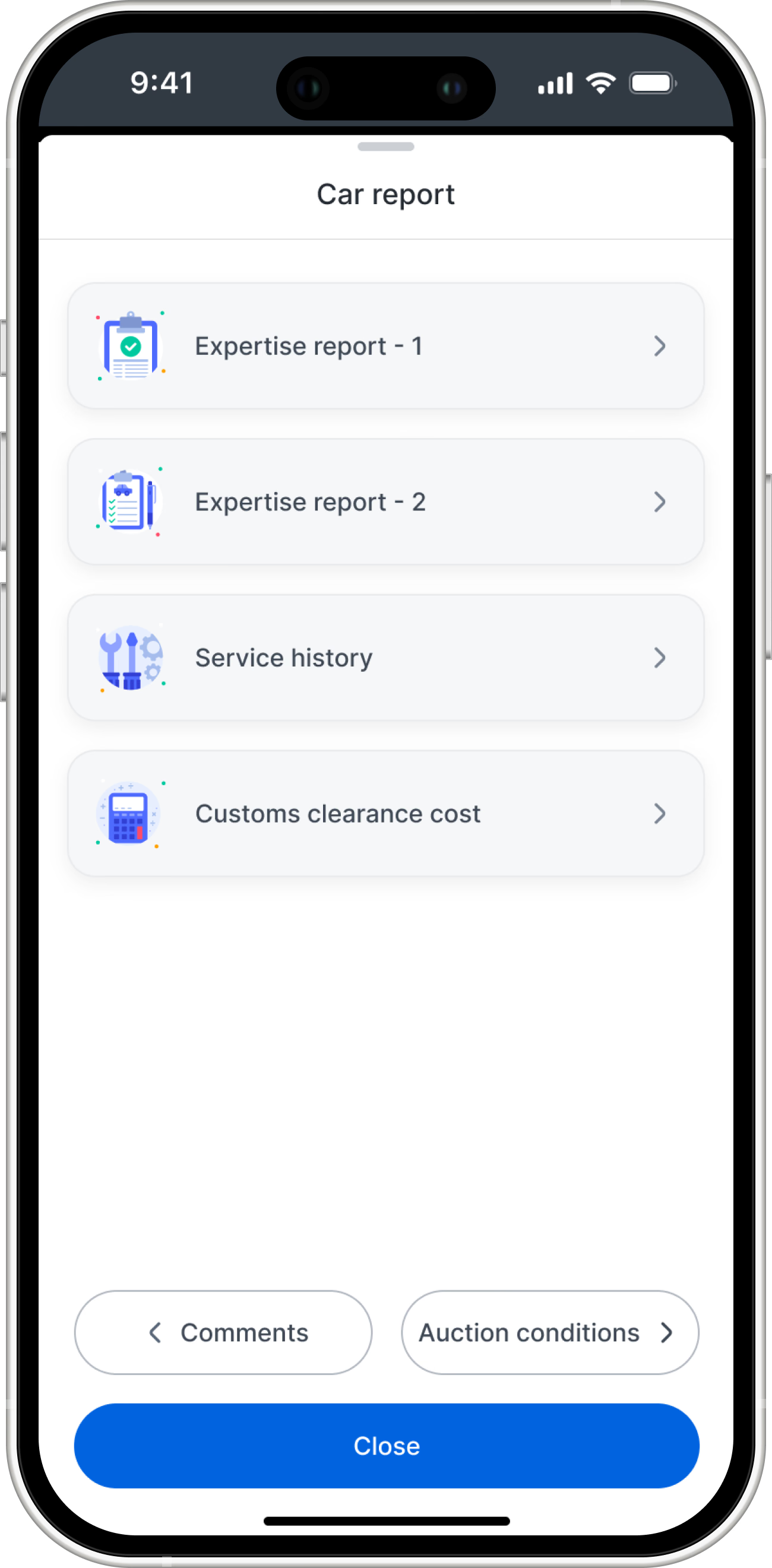
A persistent thumbnail gallery lets users quickly scan for visual damage without opening a separate full-screen viewer.

Critical buying criteria are bubbled up into a clean visual grid for instant evaluation.

Massive text dumps from the auction houses are organized into neat, collapsible sections.



Total cost transparency

Users can smoothly swipe through heavy technical data without constantly opening and closing modals, drastically reducing friction.

- A persistent thumbnail gallery lets users quickly scan for visual damage without opening a separate full-screen viewer.
- Critical buying criteria are bubbled up into a clean visual grid for instant evaluation.
- Massive text dumps from the auction houses are organized into neat, collapsible sections.
- Total cost transparency
- Users can smoothly swipe through heavy technical data without constantly opening and closing modals, drastically reducing friction.
THE CORE ENGINE
Total Cost Transparency
During user interviews, the loudest pain point was margin destruction caused by hidden auction fees. Resellers calculate their profit margins down to the dollar, and surprise fees at checkout completely destroy platform trust.
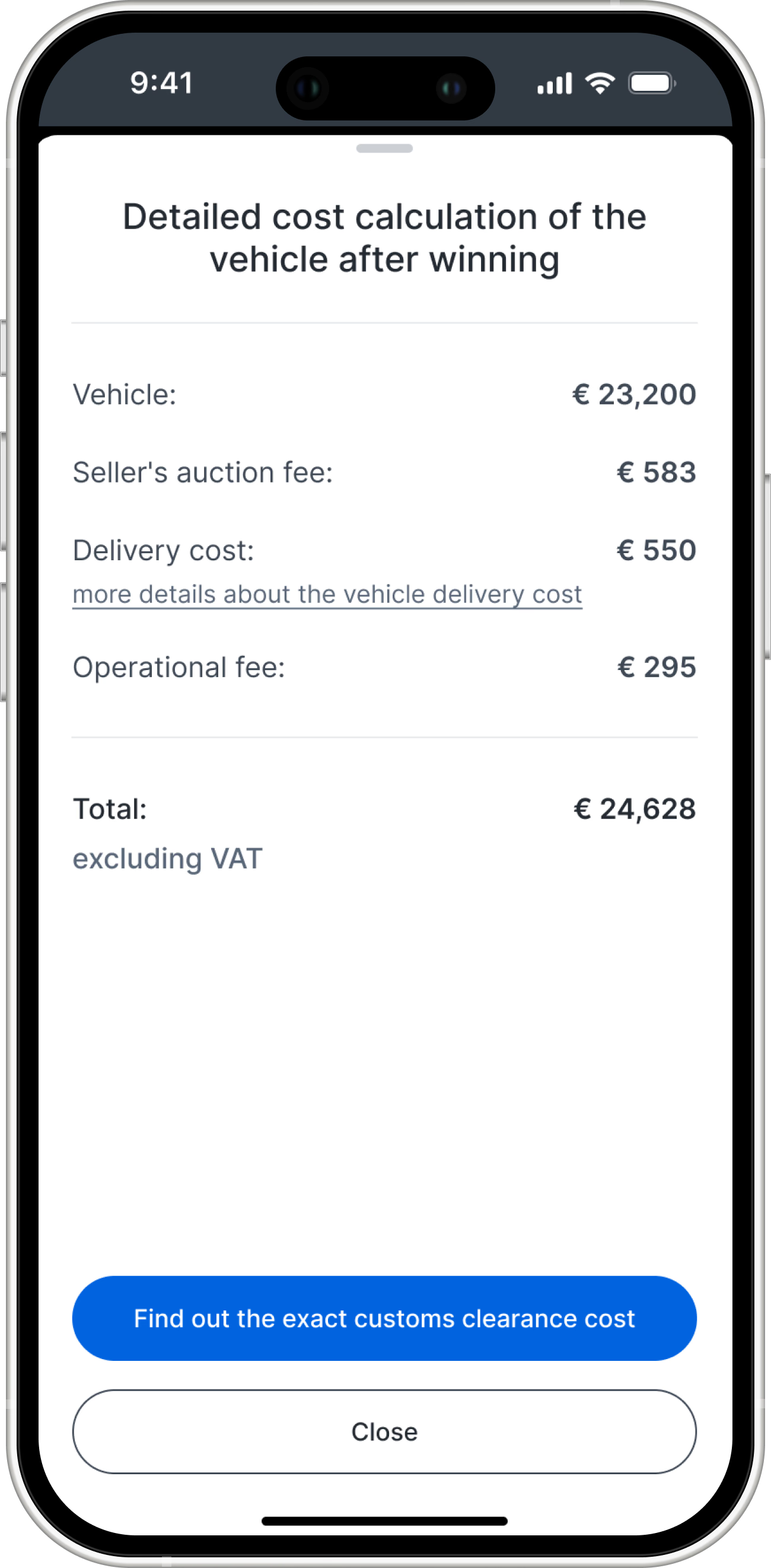
To solve this, I designed a dynamic bidding engine. As the user types their maximum bid, the "Total cost of the car" updates in real-time, instantly factoring in all auction services, taxes, and platform fees. "Total cost of the car" is clickable, which immediately opens a transparent, itemized breakdown of every single charge. This absolute transparency empowers users to bid aggressively with total financial confidence.
The Bidding Engine
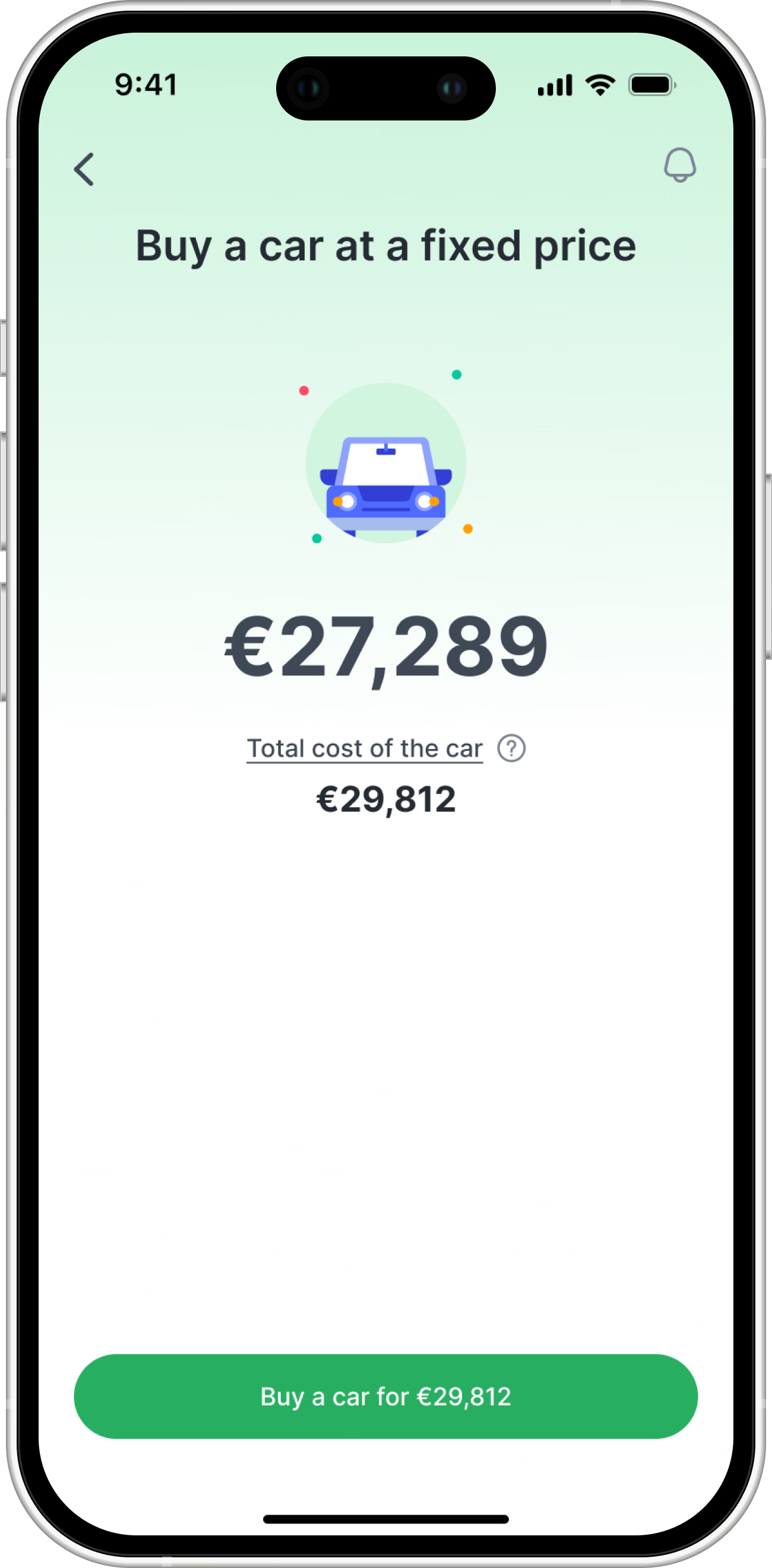
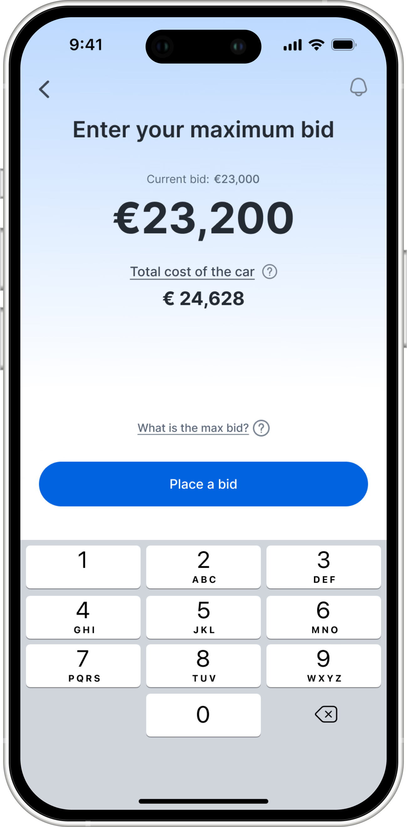
Clear actions, distinct color coding separates the standard auction bid from the instant "buy it now" option.
Tapping the info icon reveals an itemized receipt of all fees before the user commits, building absolute trust

- Clear actions, distinct color coding separates the standard auction bid from the instant "buy it now" option.
- Tapping the info icon reveals an itemized receipt of all fees before the user commits, building absolute trust
Impact
Outperforming the Legacy Web
The application successfully launched on both iOS and Android and immediately shifted user behavior. By solving the core friction points of the legacy platform, the app became the primary tool for professional resellers.
The Results
I reduced onboarding drop-offs by 12%
By identifying the "trust barrier" during research, I replaced the forced €800 upfront deposit with a product-led exploration flow, immediately increasing registration completion.
I increased user confidence with real-time data
I designed a dynamic bidding calculator that eliminated hidden fees. Qualitative feedback confirmed this UI decision empowered users to place faster, budget-safe bids, making the app their primary trading tool.
92% users use mobile application
I designed the mobile-first search architecture, which drove a 92% shift in total bidding volume from the legacy web platform to the new app.
I decreased support team overhead by 35%
By transforming messy, unstructured auction data into scannable damage reports and transparent fee breakdowns, I eliminated the core points of confusion that previously forced users to call sales managers for clarification.
Lessons Learned
- I utilized stakeholders as user experts: instead of treating stakeholders as just "approvers," I facilitated syncs to extract their deep knowledge of the B2B business model. These insights directly shaped the margin-driven filtering logic I designed.
- I aligned the technical teams to hit our deadline: acting as the PM, I established strict communication cadences between the client, our frontend developers, and the backend team. By clarifying exactly what the UI should look like and tracking our core metrics, I ensured we shipped the complex MVP on a strict timeline with zero compromises on quality.