Reducing support costs by 74% through clear structure and automated settings
A complete platform redesign, improvement of the onboarding process, and design system implementation for the multifamily housing industry's leading analytics tool.
- Company
Street Digital AI
- Platform
B2B, Desktop SaaS
- my role
Solo Product Designer (End-to-End)
- Team
- Key Stakeholders
- Project Manager
- Dev Lead
- Myself
- Timeline
8 weeks - 2024
About Street Digital AI:
Street Digital AI is a leading multifamily marketing agency. To help their clients optimize property performance, they offer Street Digital Apartment Intelligence (SDAI), a proprietary analytics platform that consolidates marketing, operations, and market data into one actionable report.
While the data backend was powerful, the frontend looked old. This outdated visual interface hurt company chances of winning new clients. With a major industry conference in Las Vegas only 8 weeks away, stakeholders needed a complete overhaul. The goal was to present a modern, stable product to prospective clients at the event.
The Challenge
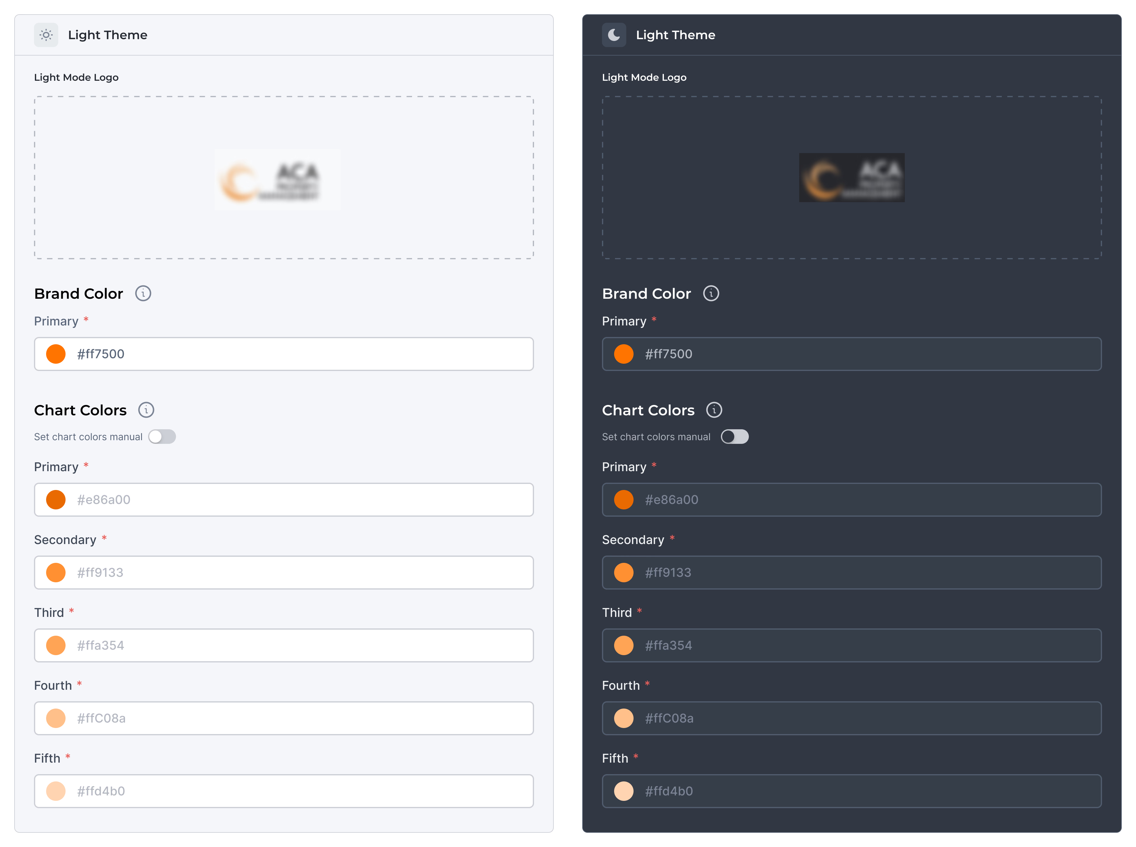
Beyond just looking old, the platform had a critical usability problem: the "Brand Personalization" feature. This feature allows companies to set their own brand colors on the platform, creating a personalized approach for the clients. But it was completely hard to understand and broken.
- Too many choices: users were asked to manually input 14 different color hex codes (7 for the Light Theme, 7 for the Dark Theme).
- No instructions: users couldn't understand which colors changed which parts of the platform.
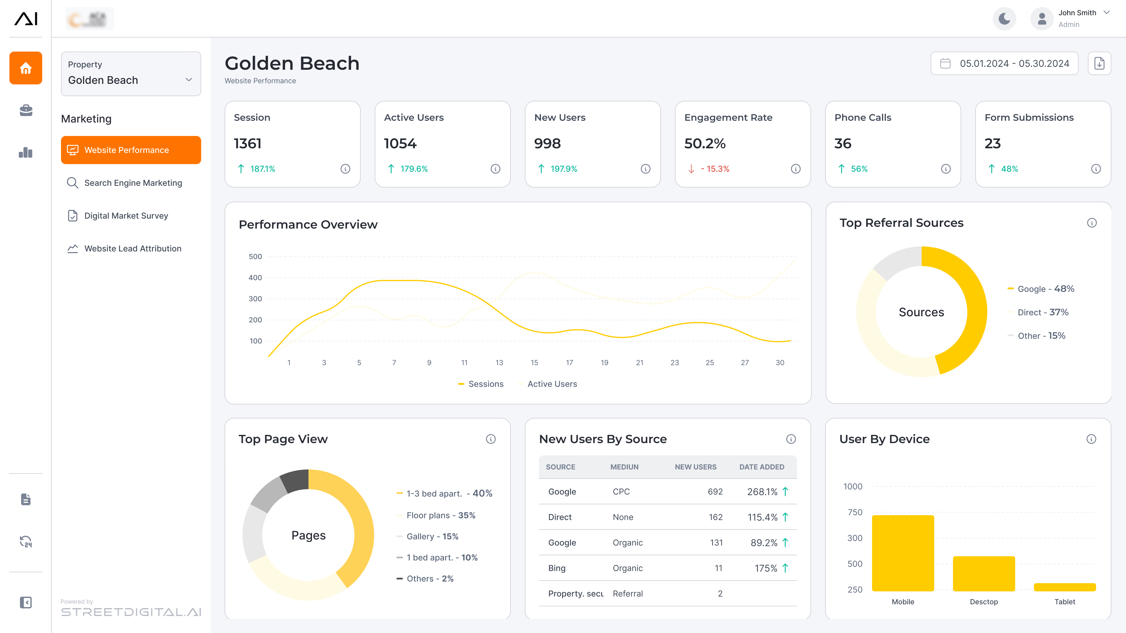
- Accessibility failures: because users were guessing, they often inputted colors that severely violated contrast ratios (e.g., light text on light backgrounds), making their dashboards unreadable.
This confusion led to broken themes, frustrated users, and a massive flood of support tickets. My task was to fix this confusing flow, stop the support calls, and design a beautiful platform ready for the Las Vegas conference.
The Results
Influenced
I streamlined the onboarding and color configuration flow, making it intuitive for new users and reducing related support requests by 74% within three months.
Delivered
I completely redesigned the platform's visual language, updating typography, components, and interactions. This unified the experience and raised the overall quality of the product.
result
We ensured all design deliverables were ready for the conference. The polished UI directly helped the sales team attract two major enterprise clients and boost company revenue.
Handed-off
I initiated the product’s foundational design system, creating a unified style guide and token structure for future engineering scaling.
Earned
Because of my impact on this high-stakes project, leadership offered me a full-time position as a Product Designer.
Discovery
Finding the Root Cause
Before jumping into designs, I needed to understand exactly what was breaking. I spoke with the customer support team, analyzed support logs, and held stakeholder interviews. Through this research, I identified two main friction points:
key insights
- No context: users were asked to set "Primary," "Secondary," and "Third..." colors, but they had no idea how these colors would actually look on their platform.
- Outdated interface: the visual design looked old and didn’t match the sophisticated, smart technology powering the platform behind the scenes.
The insight: simplify the onboarding configuration to zero-friction and modernize the visual language to build trust.
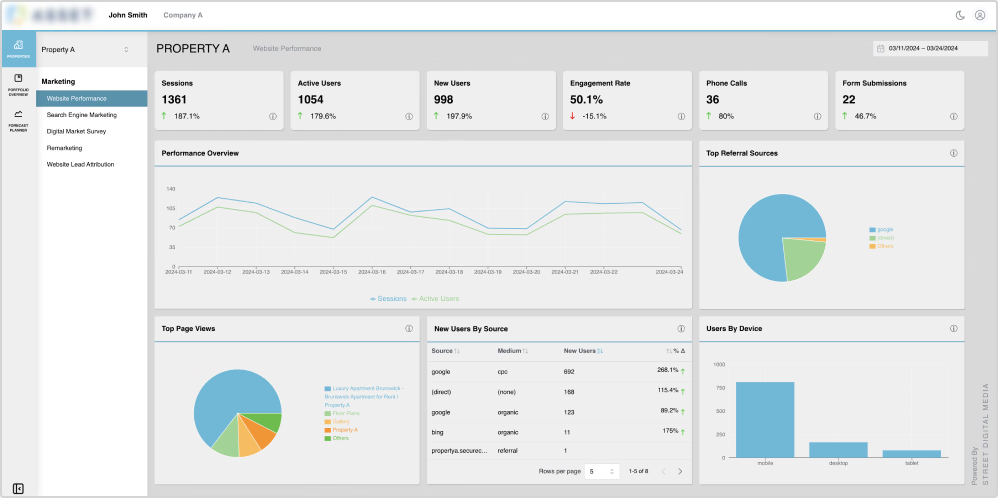
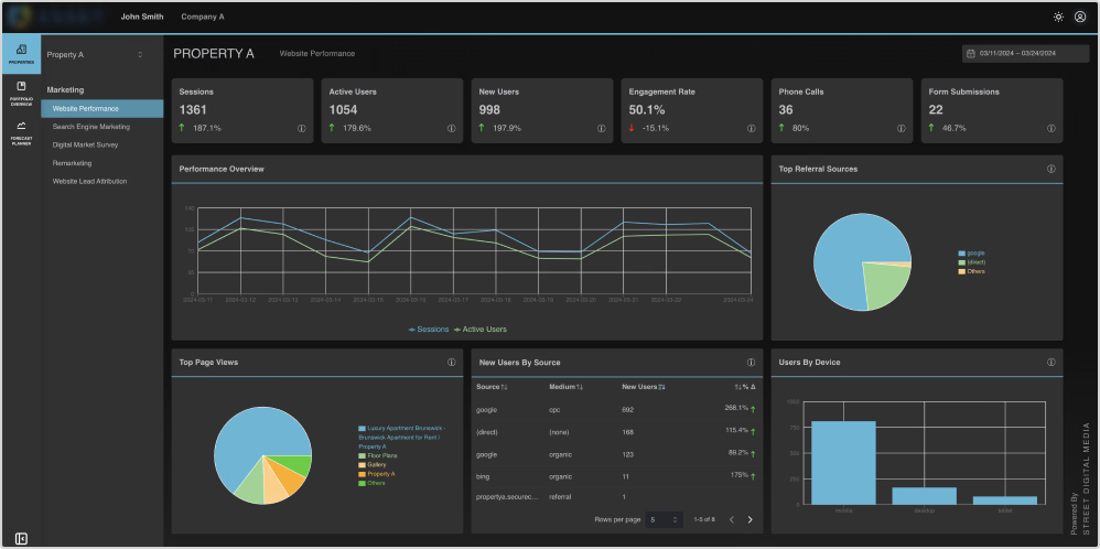
Screenshots of the old platform UI in the light and dark modes
Before the Redesign
- No clarity for the color mapping
- Zero visual feedback
- Outdated interface
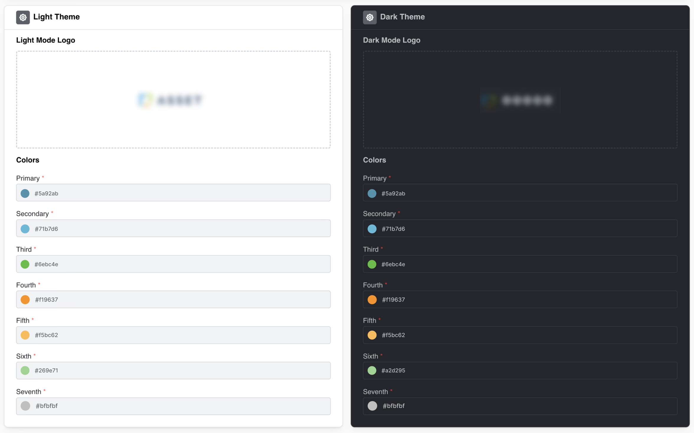
Screenshot of the old color personalization feature whereusers forced to manually guess 14 different hex codes.

- Before the Redesign: No clarity for the color mapping; Zero visual feedback; Outdated interface
Screenshots of the old platform UI in the light and dark modes
Screenshot of the old color personalization feature where users forced to manually guess 14 different hex codes.
The Solution
1. Simplifying the Setup
To fix the 14-color nightmare, I completely rethought the user flow. The goal was to make onboarding foolproof and fast.
Clear Grouping:
I’ve divided the colors into two simple blocks: "Brand Color" and "Chart Colors."
Visual Cues:
I’ve added visual cues so users instantly understood exactly what part of the dashboard they were changing.
Cut the Clutter:
I’ve reduced the required colors from 14 down to just 6. I removed the 7th color entirely because my research showed it was redundant and always defaulted to gray anyway.
Auto-Syncing Themes:
Instead of making users pick colors for "Light Mode" and then again for "Dark Mode," the new system auto-syncs. When a user picks a color in the light theme, the system automatically applies it to the dark theme.
Before
After
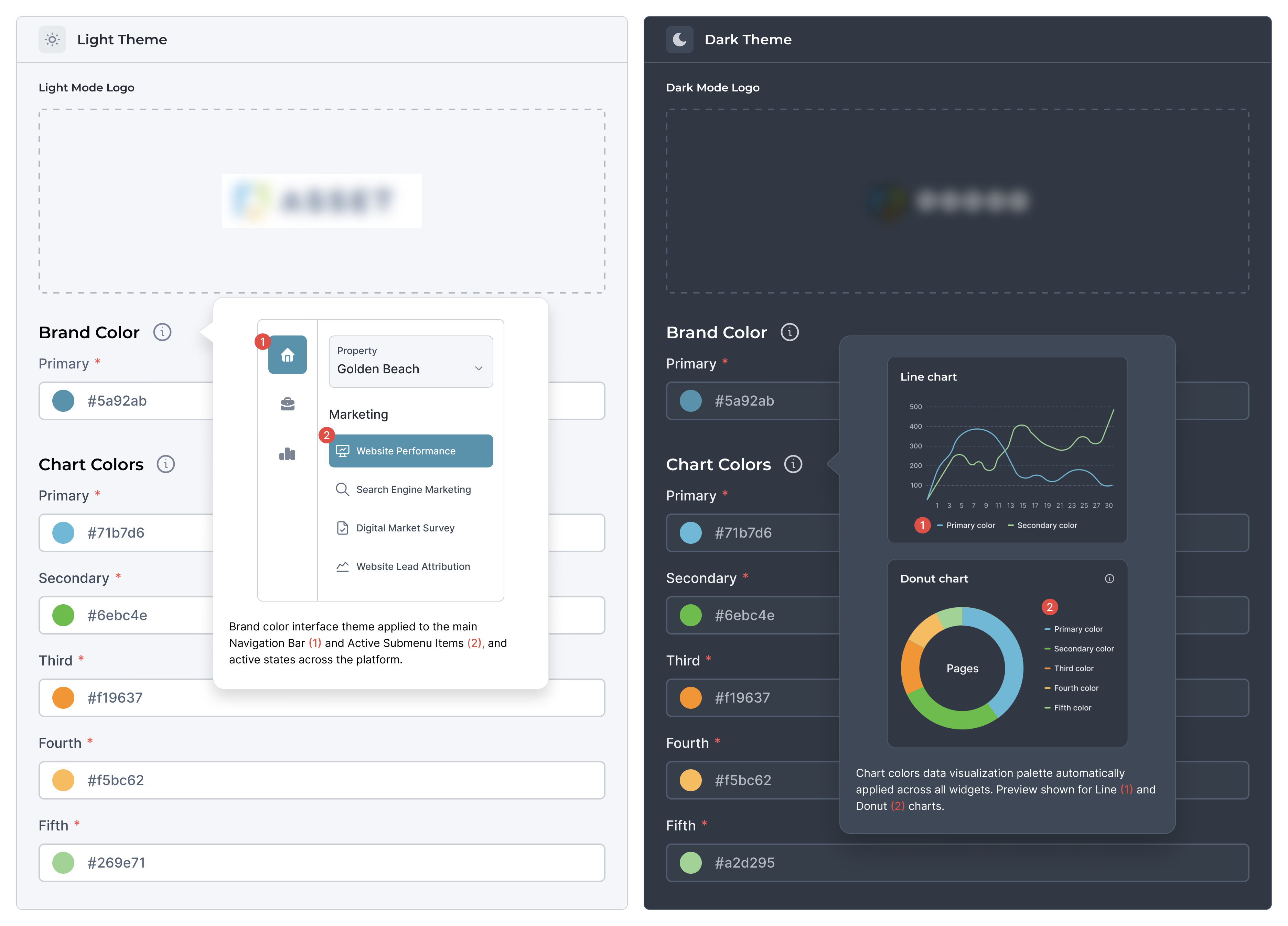
Two clear sections "Brand Color" and "Chart Colors" with visual tooltips


Primary brand color sets the main theme for navigation, buttons, and active states across the platform.

Data visualization palette: these colors are applied exclusively to graphs and performance metrics to ensure high data contrast.
- Two clear sections "Brand Color" and "Chart Colors" with visual tooltips
- Primary brand color sets the main theme for navigation, buttons, and active states across the platform.
- Data visualization palette: these colors are applied exclusively to graphs and performance metrics to ensure high data contrast.
2. Engineering Constraints and Final UI
With the conference only 8 weeks away, time was our biggest enemy. I worked closely with the lead developer and learned we had two major technical limits:
Constraints
- Charting libraries: the developers used specific code libraries to build the data charts. I reviewed these libraries first to make sure my new designs could actually be built within their limits.
- Design system scope: building a full, complete design system from scratch takes months. We didn't have that time. I made the strategic decision to only design and implement the rules for the key components needed for the conference. We agreed to scale the rest of the design system after the presentation.
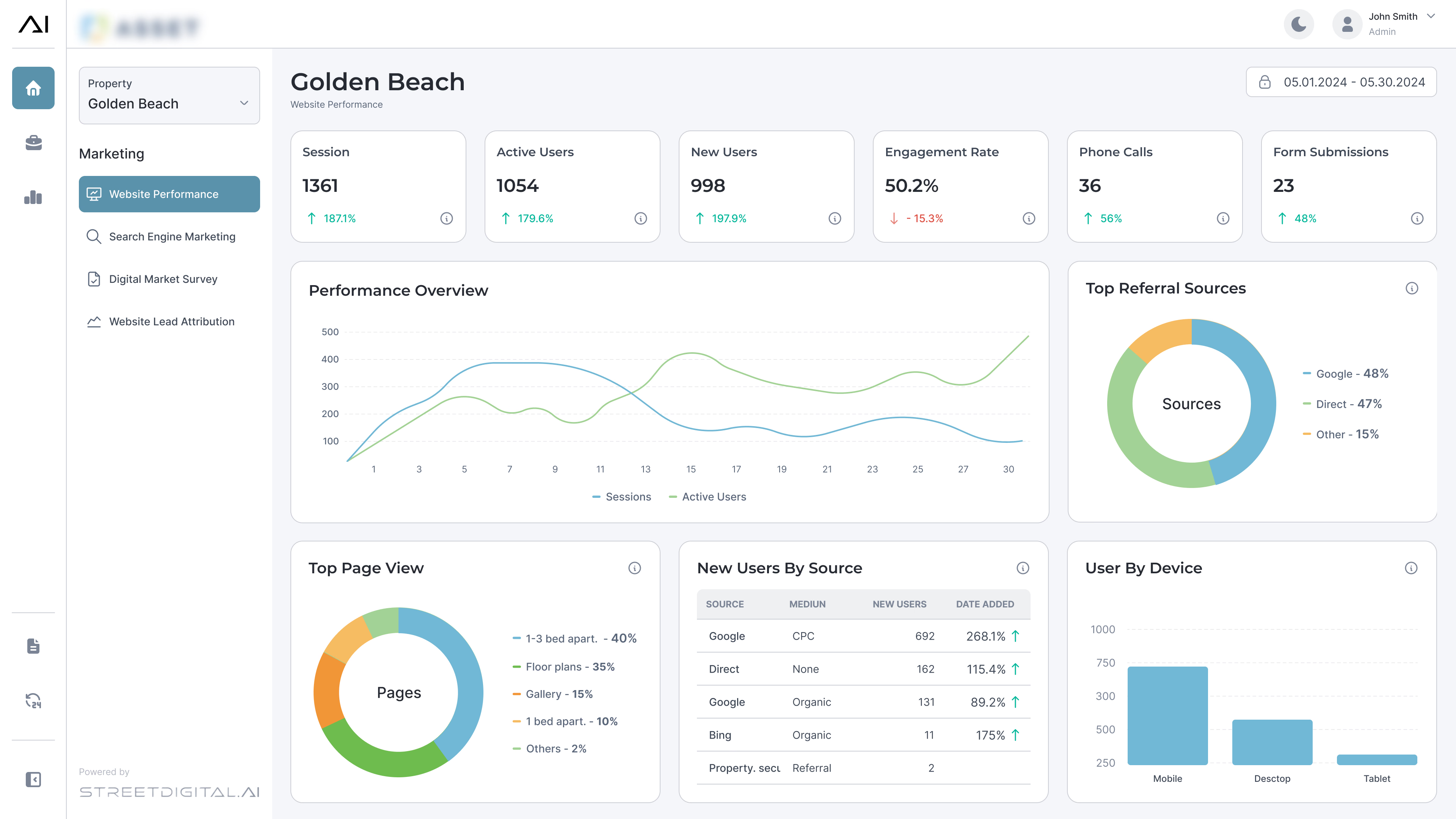
I mapped our new color tokens directly to the existing front-end charting libraries, navigating strict visual constraints to ensure developers could build the UI on time
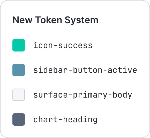
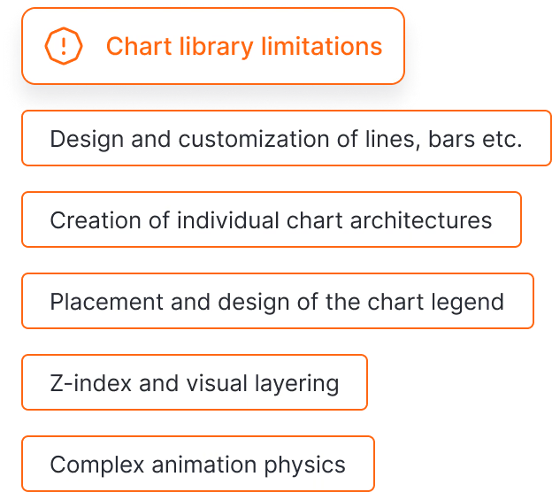




I mapped our new color tokens directly to the existing front-end charting libraries, navigating strict visual constraints to ensure developers could build the UI on time
3. Validation and Testing
To meet our deadline, we skipped traditional "research, design, test, build" phases and used parallel development, and testing functionality as soon as developers built it. We ran 6 unmoderated usability tests.
- 6Unmoderated tests 15–20 min each
- 0Errors from users
- 4 / 6Users surfaced the same insight unprompted
EXISTING USERS — 3
Previously contacted support about color setup.
Immediately understood the new grouping
NEW USERS — 3
Zero prior exposure to the platform.
Completed task first try, zero errors
"What if I just enter the company's primary brand color, and the platform automatically generates the rest for the charts?"
This wasn't a coincidence, it was a pattern. I brought it to stakeholders and engineering, and we made a clean call: ship what's tested and stable for the conference, move the auto-generator to the top of the roadmap.
SHIP — CONFERENCE
6-color grouped setup with visual cues and auto-syncing themes. Tested, stable, ready to demo in Las Vegas.
ROADMAP — NEXT RELEASE
One-input auto-generator: enter one brand color, platform builds an accessible, contrast-safe palette automatically.
Before
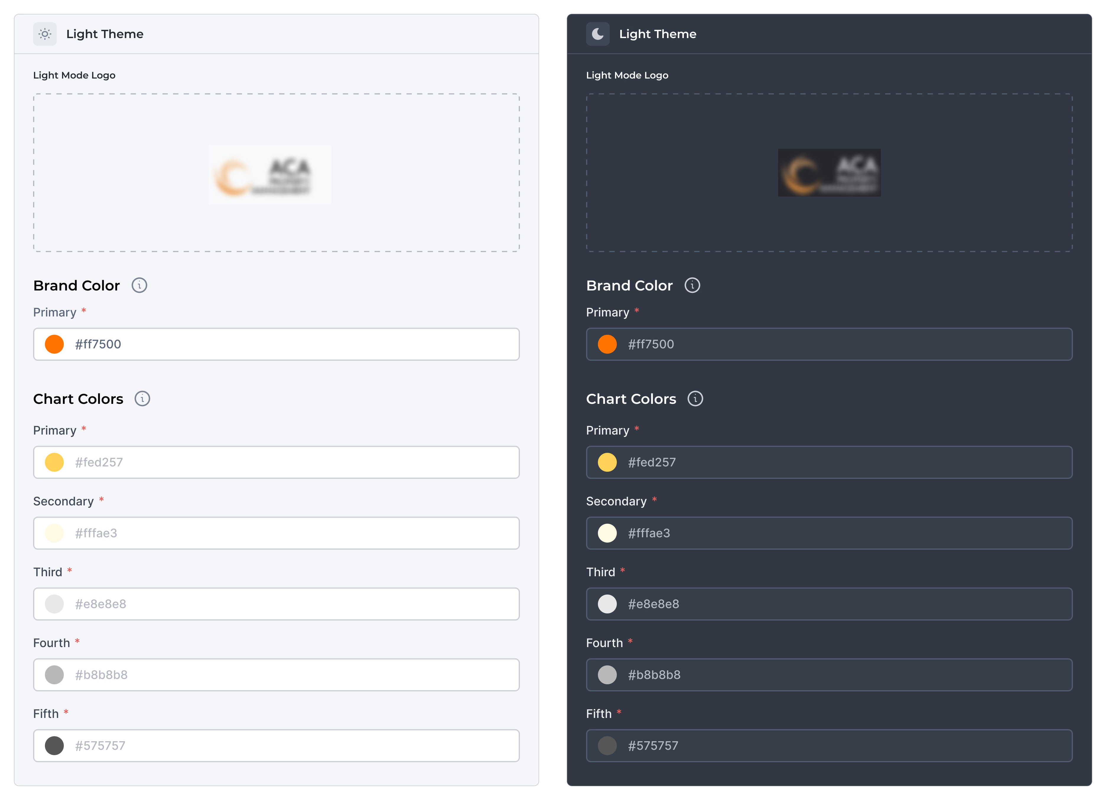
Example of low-contrast colors that were blindly set by the user before any improvements, resulting in unreadable contrast in the user interface
After
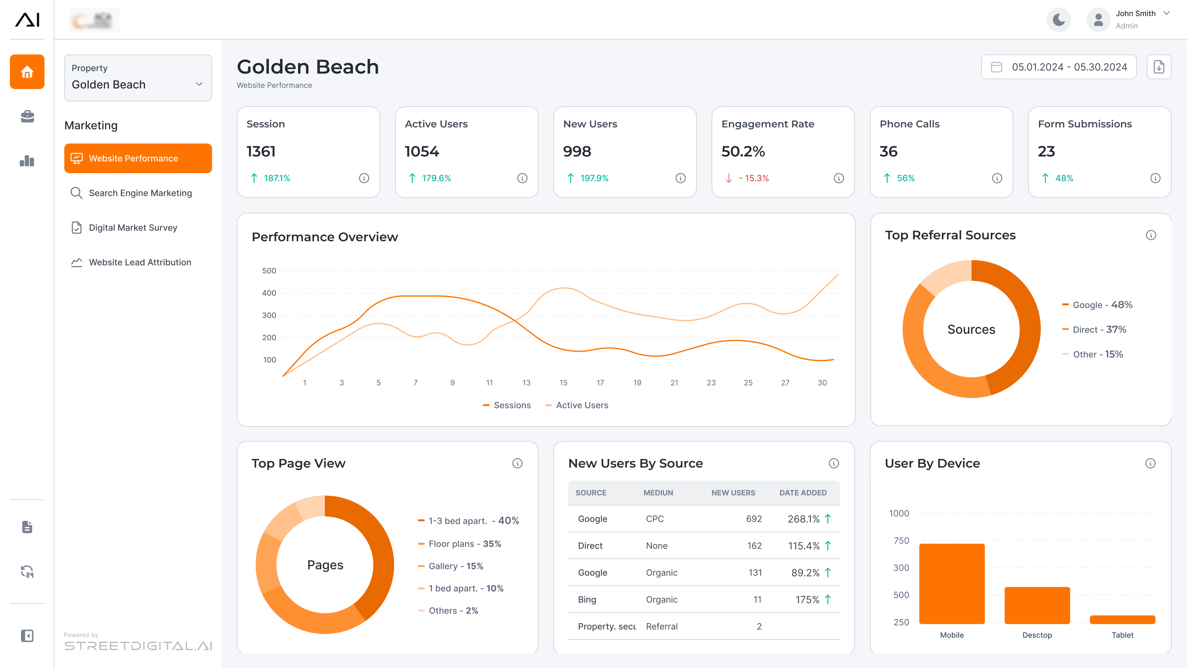

The platform automatically generates accessible colors based on the users' primary color, while still allowing them to create a color palette manually.
- The platform automatically generates accessible colors based on the users' primary color, while still allowing them to create a color palette manually.
Example of low-contrast colors that were blindly set by the user before any improvements, resulting in unreadable contrast in the user interface
The Final Deliverable
One input, flawless output
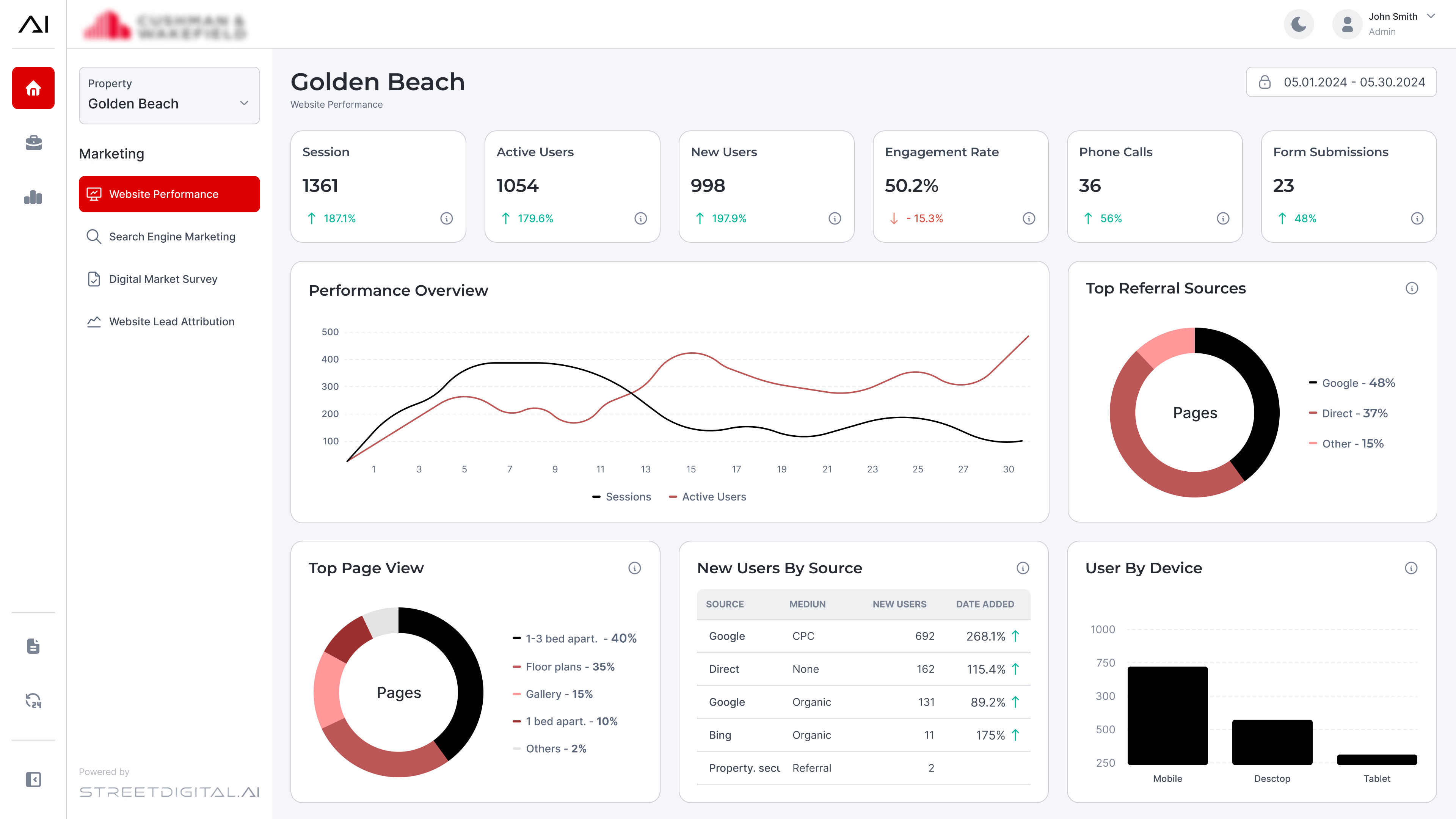
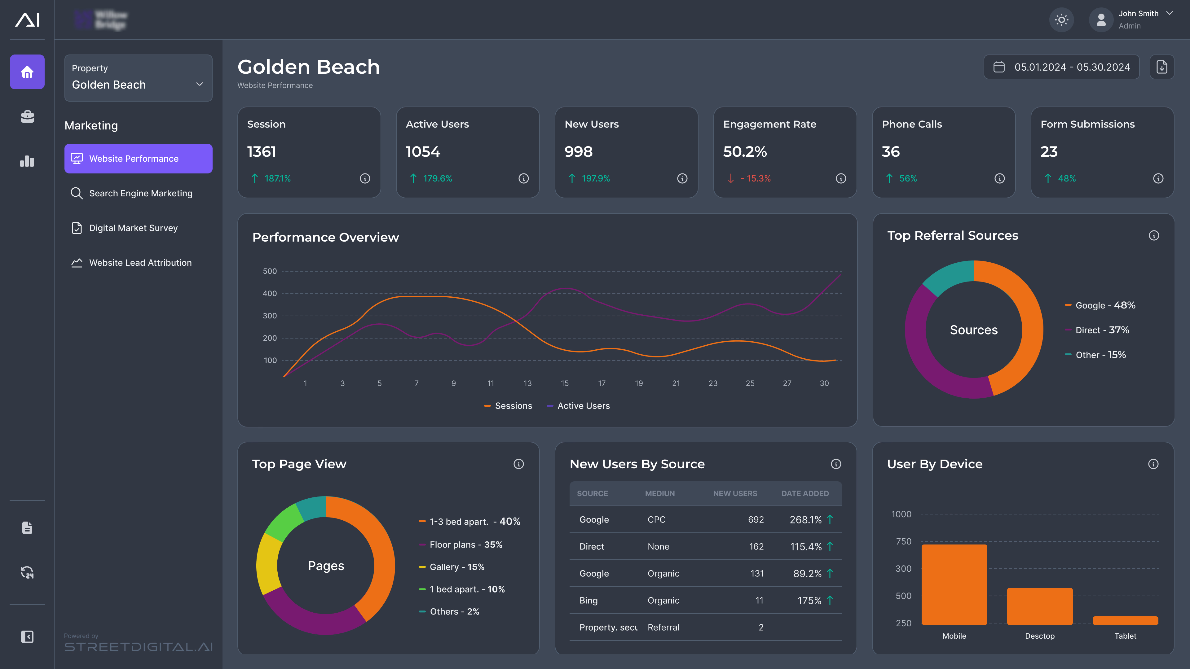
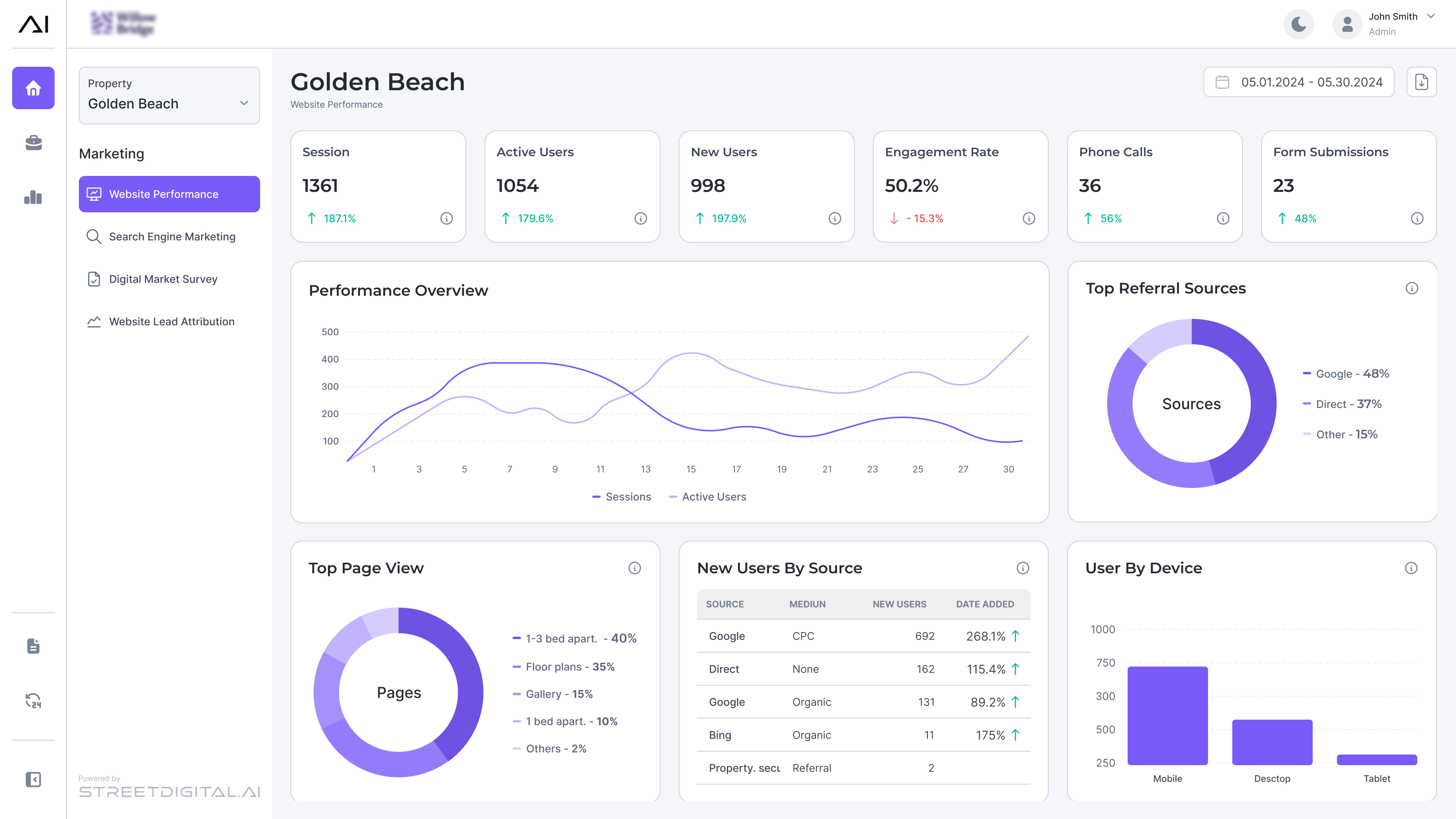
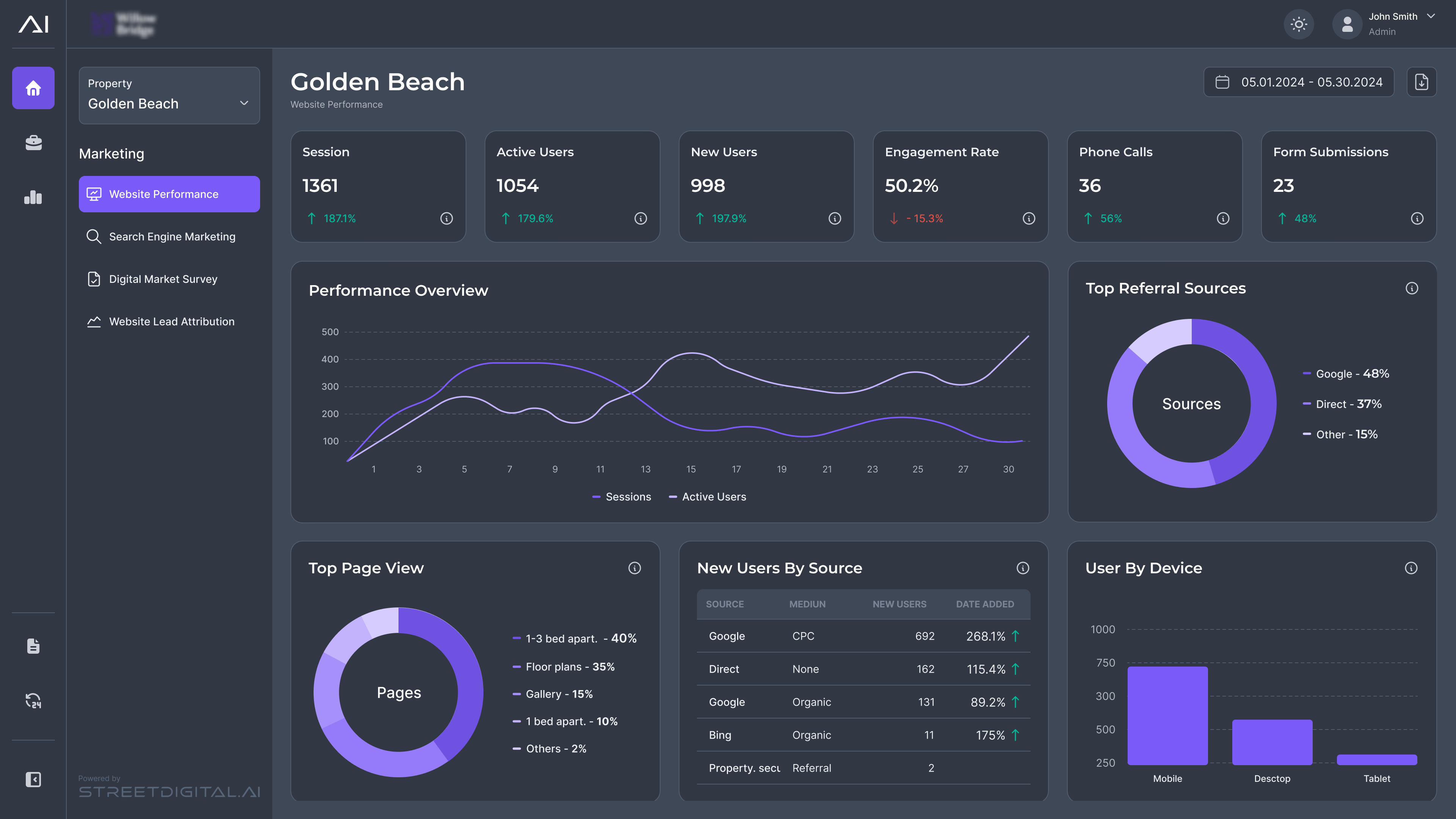
To show the scalability of the new design, here is the system stress-tested across two drastically different enterprise brand identities. By constraining the manual color inputs and automating the data visualization palettes, the platform now dynamically adapts to any client's brand. Whether viewed in Light or Dark mode, accessibility is mathematically guaranteed, completely eliminating the friction that previously flooded the support inbox.
Before
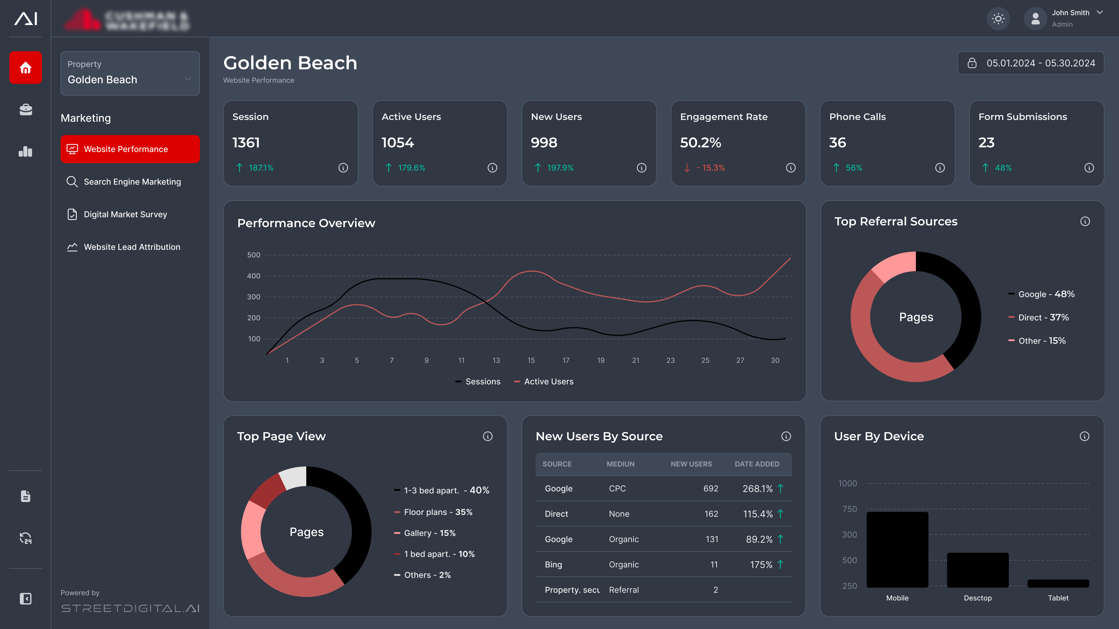
After
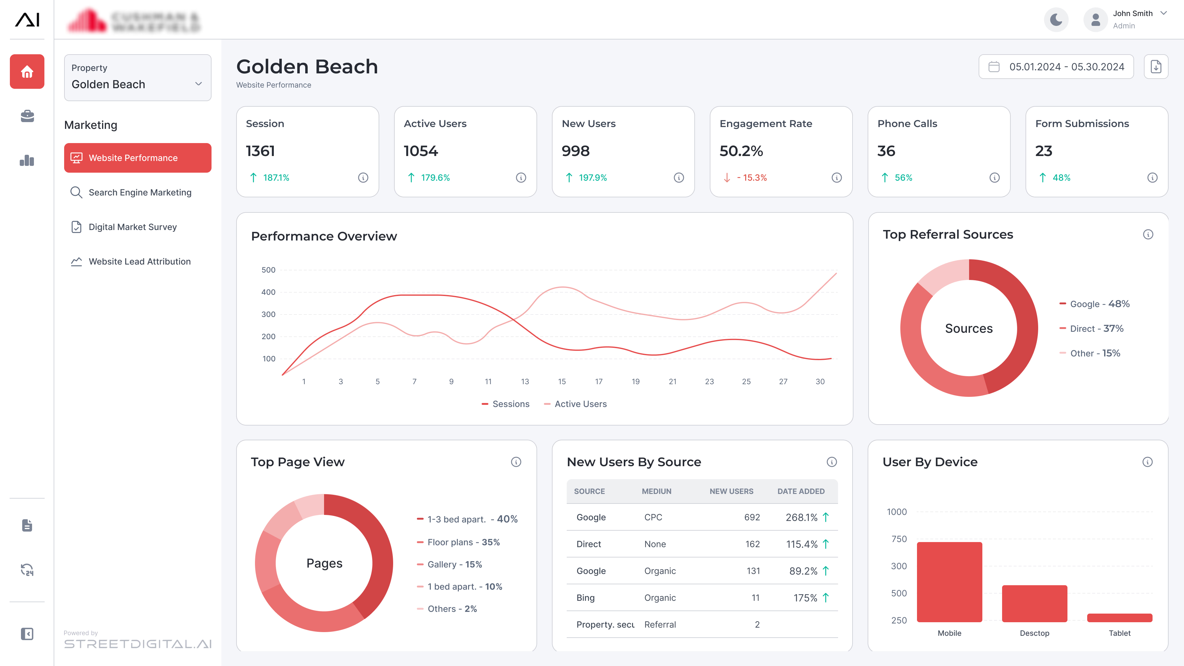
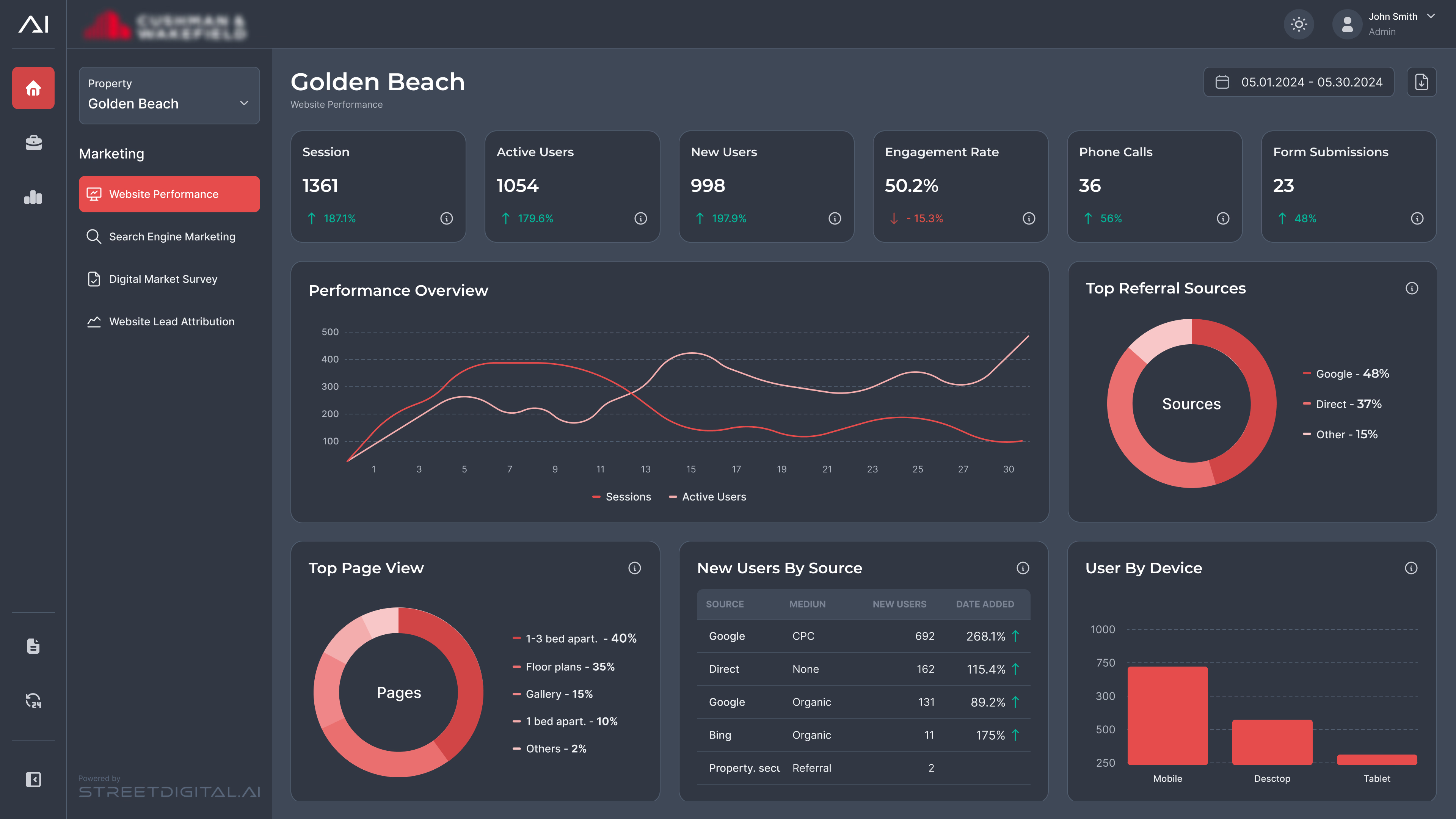
Before
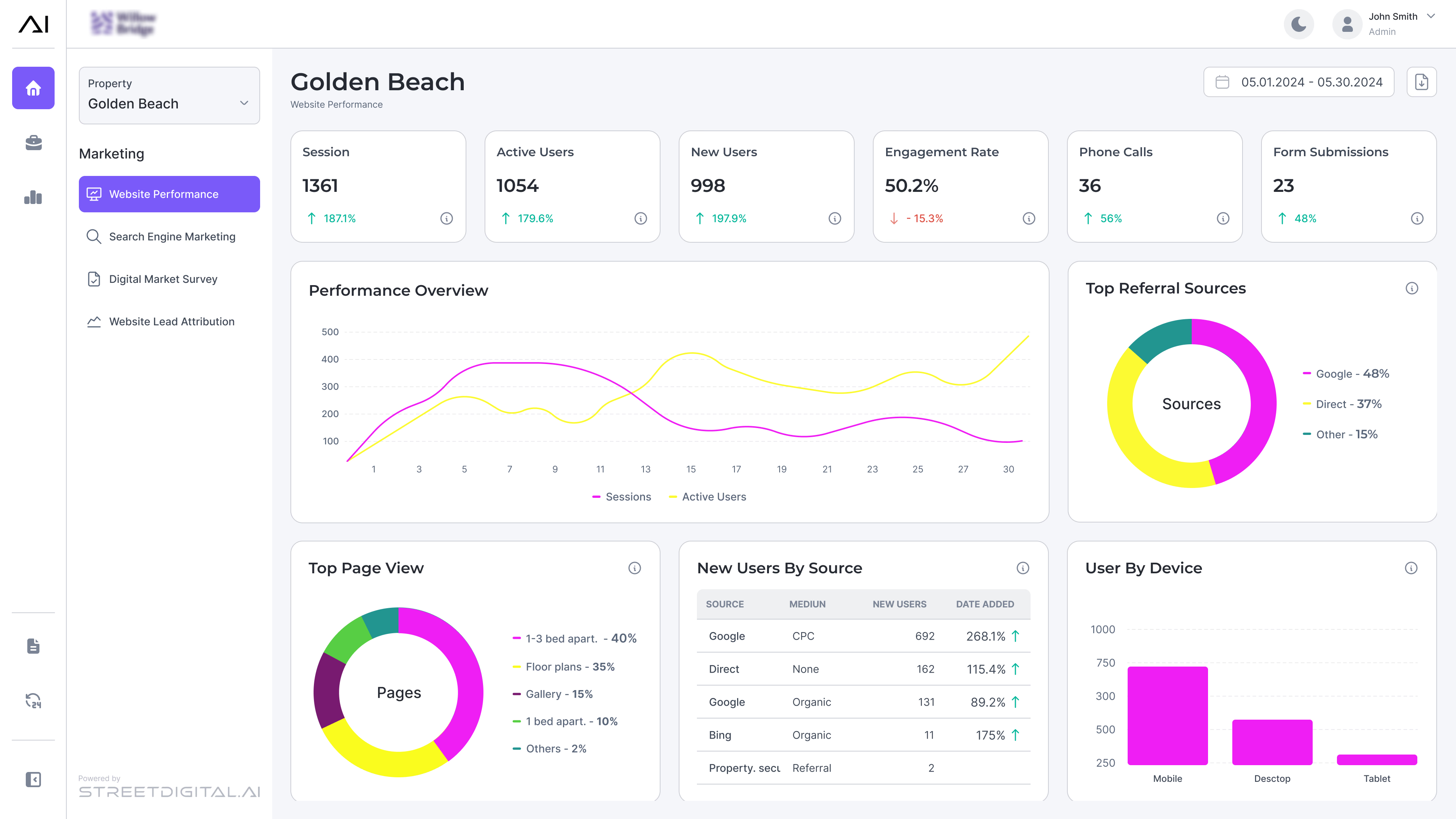
After
Lessons Learned
- Instead of just guessing what was wrong with the old interface, going straight to the support logs was the right decision. It showed me exactly where users were getting stuck and took all the guesswork out of my early design decisions.
- I learned that you don't always have time for a perfect, linear UX process. We had to use parallel development to hit the deadline. But I realized that as long as you find some way to get your work in front of real users (even if it's fast and scrappy) and adapt to their feedback, you can still build a highly successful product.
- Sitting down with the team early on to figure out our actual technical limits, like what the charting libraries could and couldn't do, it was the major reason we managed to launch on time.